-
Gmail vs. Outlook
As soon as I could get an invite, I switched to using Gmail for my personal E-mail. It’s initial appeal was in the mind-blowing free storage quota – 2GB compared to other services that were still just offering a handful of megabytes. But it’s open approach to POP3/SMTP clients (letting you use whatever client you wished), its simple & clean web interface, relatively effective spam filtering, and search-for-organization paradigm would also grow on me. Indeed, even the knowledge that I could one day easily forward my account elsewhere if things didn’t work out was something I really thought highly of.
Great as the core service was, and though the web interface was handy when I needed it, I actually continued to use Microsoft Outlook as my primary mail client. Besides familiarity, Outlook had no issues with large volumes of mail (I have about 45GB of work E-mail in PST files from the past decade), search finally became decent as of Vista, the HTML mail editor was quite good (and better than any web-based editor I’d used), and it gave me a single client for work E-mail (via Microsoft Exchange Server) and personal E-mail. Since I did want to keep my work and personal E-mail separate, if I needed access to my personal mail outside my home I still used Gmail’s web interface, but otherwise, I was using Outlook. For my needs, it was just the better client.
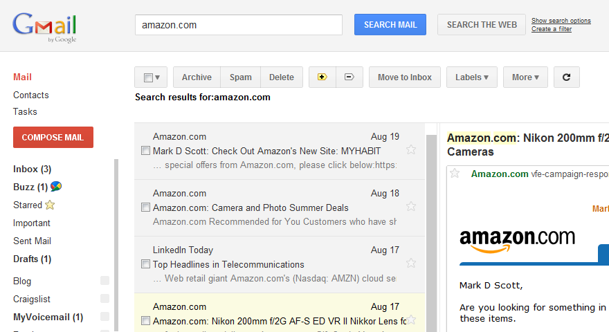
That changed with the availability of the Preview Pane for Gmail, which is a “Labs” (beta) add-on that you can opt to use with the web interface. If you click on Options (top right) -> Mail Settings -> Labs, one of the “Available Labs” is called Preview Pane. You can enable it to get what at first glance seems like an layout cloned from Outlook:
The above screen shot isn’t the best, in part because this extension works the best when you have a large monitor, and in part because Amazon thinks I can afford the 200mm f/2G (a $5,000 lens). I’m fortunate enough to use a 30″ monitor both at home and at work, but posting an 1800-pixel wide image above would not really have helped most people I think.
Basically, though, you can see that the main area is now split into two panes; the left pane shows the list of conversations, and the right pane shows the messages within the selected conversation. Without the extension, when you click on a conversation it normally replaces the message list. I don’t know why it’s called “Preview Pane” other than Microsoft Outlook calls it that. It’s really just a two-panel view (or three-panel, if you count the folder/label list).
Why is such a seemingly cosmetic change so important to me that it sealed the deal? A few reasons:
- It finally gives Gmail an mode of operation that’s optimized for large desktop monitors like the one I use. The prior interface simply left most of my screen real estate unused.
- I can jump directly between messages of interest. Before, if I wanted to read messages # 1, 3, and 7, I had to click 1, click Inbox, click 3, click Inbox, and click 7. Now I can just click 1, 3, 7. This greatly speeds up dealing with mail, much more (for me) than the Priority Inbox feature did.
- It’s better for handling new incoming messages. I can see the new message show up in the message list without interrupting what I’m doing. Before, clicking on the pop-up notification of a new message spawned a new browser window which was always right on top of the one I was previously looking at (because of the way the browser spawns new windows by default – press Ctrl-N and you’ll see what I mean).
- Another reason it was better for handling new messages was that clicking on a new mail pop-up is slow, especially if your connection is not awesome. It would often take 3 or 4 seconds for the window to load and for the message appear. Now, although the mail doesn’t show up in the message list as instantaneously as Outlook, it does get there pretty fast and I can click and see its contents immediately.
Google really prides themselves on speed, as you can see from their insistence on telling you how fast your search ran – but this extension is a great example of how just a better layout with the same underlying technology can make thing vastly faster for the end user. This isn’t going to be perfect for every form factor, but it’s great for me, and it has me using Gmail via the web as my preferred client. I strongly recommend giving this a try!
