-
If You Visit Sandakan…
Despite many visits and much time spent in peninsular Malaysia, until this summer we’d never visited east Malaysia – made up of two states, Sabah and Sarawak, on the island of Borneo. But they’re definitely worth visiting in particular for the unique wildlife that’s found there. We spent a few days near Sandakan, in the northeast part of Sabah, hoping to see some of the species the area is known for – orangutans, probiscus monkeys, hornbills, sunbears, and others.

I wasn’t able to bring my actual camera on this trip, sadly, so these images are sadly just from my phone. That said, it’s amazing to get close enough to a wild hornbill (below) that even a phone can get a usable image. We did also see some wild probiscus monkeys, but even the serious folks with 600mm lenses that are much longer than what I own didn’t have an easy time at those distances.

The main point of this post, however, isn’t that you should go to Sandakan. It’s that if you do, then you should definitely reach out to Christopher, who drove us around in the day we spent near Sandakan city. He picked us up from our accommodation in the morning, brought us to the main nearby attractions – the Sepilok Orangutan Rehabilitation Center, Bornean Sun Bear Conservation Center, Rainforest Discovery Center, and Labuk Bay Probiscus Sanctuary, but also found great local spots for breakfast, lunch, and dinner, took us to some marvelous views from a hilltop Buddhist temple, and showed us a few other nature things we’d definitely not have noticed. Plus, he corrected rather foolish elements of our original plan that would have missed key feeding times or run into other issues.

There are a number of packages on sites like Tripadvisor that offer day trips like this, but that are essentially just middlemen that probably keep half or more of what you’re paying, with little guarantee of who the actual provider will be. Christopher was excellent, and I’m just lucky that I trusted some random Facebook post I ran into via Google Search (I don’t even have a Facebook account) who similarly shared that they had a great time with Christopher (though in much fewer words). There’s no guarantee he’ll be available on the dates of your trip, and he said he’s likely to retire in several years, but I can’t recommend him enough!
You can reach Christopher on WhatsApp at +60 16-837 6629.
-
No More Working From Home
Its been almost ten years since I posted anything; I guess things got even busier than I realized! Fortunately, I now have a little more time now that I’m not working from home. Or from the office! I greatly enjoyed my time at Google so it was a tough decision to leave, but I’ll save that for Linkedin, maybe. For now, I thought it’d be fun to share the final state of my home office.
I’ve always been the type to do a little work from home, and the Chrome team was highly distributed to begin with, so in many respects we were set up for the pandemic as well as we could be. The one exception is that my home office was in a windowless room in the basement, with a single bulb overhead fixture, so lighting and thus video calls were terrible by default. Fortunately, that’s a fixable problem, though I may have gone a little overboard with the solution:

On the left is my “normal” desk, essentially the same as it’s always been except during my Google time a KVM allowed switching between my personal Windows box, and a corporate Chrome OS machine. On the right is the final iteration of the setup I used for videoconferencing.
Lights, Camera, Action!
A few Google Home integrated smart plugs switch between the default lighting configuration above, and VC mode:

The lights follow a suggestions online for a standard 3-point lighting setup, with a large key light, and smaller fill and (overhead) back lights. Many professionals have books in the background, so you know you’re talking to someone educated. So mine is almost all videogame paraphenalia – no point trying to fool anyone!
From the inside, it looks like a weird three-screen setup:

The trick is that the middle screen is actually the reflection of a a flat display that’s facing up; it’s reflecting off beamsplitter glass that has a camera behind it. As a result, when there’s a meeting in progress, the person you’re talking to appears in front of the camera – so they see you looking directly at them (whereas before, with a big monitor, it really seemed like I was looking off into space when I was looking at their face on screen).

The Tech Pieces
At work I gave the disclaimer that I didn’t spend any of Google’s money on this setup, since it’s frankly a little ridiculous given that a good webcam and key light is 90% of what you need. That said, the setup uses the following:
- Camera: Nikon Z7 II + Nikon 24-70mm f/2.8G (via FTZ adapter), using HDMI out. Overkill and not even optimal – the Z6 II would is cheaper and better for video – but it’s the camera I had. Sadly while the Z7 II has USB power, it can’t run continuously on it, so I still use a 3rd party EN-EL15 replacement that runs on AC power.
- Mirror: This is an 18″ x 18″ piece of 60/40 beamsplitter glass, held in place with a Nikon 7070 binocular window mount, with a 15.4″ UPERFECT flat panel display (better than others I tried as it’s 400 nit brightness helps since only half the light is reflected by the glass). The final ingredient was an HDMI left/right inverter (which was hard to find – I finally bought via Newegg as I wasn’t able to purchase it more directly via Alibaba).
- Microphone: Rode PodMic. I’d been using a Blue Yeti USB – which is great, but doesn’t do analog audio (cranking the volume and using it’s headphone port is way too noisy). I connected it via the inexpensive Pyle PMUX9 audio interface, only to discover it needs a ton of gain, and didn’t natively support 48v phantom power, so I was forced to add a Cloudlifter.
- A/V Sync: Blackmagic ATEM Mini Pro. Initially I’d set this up to easily switch between showing what’s on my screen vs. the camera feed, but this doesn’t always interact great with videoconferencing software (which will make screen share content large for all participants, but can’t always be told to do the same for a camera feed). It was also supposed to do USB capture – but unfortunately, the version I have is USB2 only (which reduces quality) and had compatibility issues with Chrome OS. So now it’s sole purpose is to combine the video from the camera with the audio from the mic, with a ~2 frame audio delay for A/V sync purposes.
- Capture: The tried-and-true Elgato Camlink (non-4K) allows the HDMI feed to be used in realtime as a webcam – and works fine on Chrome OS.
- Lights: The key light is a Neewer CB60B (70W) with a 34″ Glow softbox. The fill light is a Neewer 660B with collapsible softbox; the back light is a GVM 800D-RGB. They all support color temperature adjustment, and have been really reliable even for days with 8+ hours of continuous use.
- PC: I use an Asus Chromebox 4; while less flexible than a Windows box (e.g. for USB-based control of my camera, or using virtual camera drivers), like most Chrome OS devices it can be enterprise enrolled – so that I can use it securely for work, under Google management – despite being personally purchased.
Much of this complexity would be eliminated using a much less expensive camera with a decent mic input (the Z7 II that I already owned is great in other respects, but has a poor mic input), and usable USB webcam performance. Then you’d just need the lights (there have been Black Friday deals for $200 bundles that give you a 3-point setup), and the mirror. But it was definitely fun to tinker with this setup over the years, and while it’s certainly not Google Beam it is still much cheaper!
-
Heroes of the Dorm!

I’ve watched professional video gamers duke it out long before “eSports” had any awareness outside of a small niche, and when a company like Amazon spending close to $1 billion to buy a videogame streaming service (Twitch) was essentially unthinkable. While I’d seen the occasional televised Starcraft 1 match that aired on Korean TV, this started in earnest in 2010 when Starcraft 2 first came out – I was an early GSL subscriber and have watched consistently since then. But I’d never had the chance to attend a live event – until Heroes of the Dorm, an annual collegiate Heroes of the Storm tournament, came to Seattle the weekend of April 9th. Fortunately, my two kids are also fans, and the game itself doesn’t have a following the size of League of Legends or DOTA 2, so getting tickets wasn’t nigh impossible.
Unfortunately, although the University of Waterloo (my alma mater) was highest seed in their division, and the University of Toronto was second in theirs, they both went out early, so the event was between four schools I didn’t know – UT Arlington, UConn, Tennessee, and the ultimate winners, Arizona State.
The event itself had great production values; Blizzard clearly invested well beyond the direct economic value of the event, likely as part of an effort to bring eSports further into the mainstream, and to establish Heroes as a competitor in a genre that earlier Blizzard games (Warcraft 3) spawned, but that Blizzard is a distant third in by player or viewer base. No doubt, they had to guarantee a decent level of quality since the finals were televised on ESPN2! No matter the justification, the event held up to the high standards of quality that Blizzard has consistently held to (they’ve cancelled essentially finished games that weren’t fun enough and eaten the cost).
They had quite a few Blizzard staff on hand to meet with fans and sign posters – like Chris Sigaty (front) and Dustin Browder, who also had key roles on Starcraft 2:

The stage setup was pretty cool and highly custom, yet still reasonably intimate – making good use of the space in Seattle’s CenturyLink Event Center:

My favorite casters were on hand to cover the action! I’ve watcehd Tasteless and Artosis (left) cover Starcraft 2 including the GSL for more than five years, and they’re the best duo at it out there. Gillyweed, right, is a great Heroes of the Storm caster, who was also charming in person when we got to meet her after the event. It’s great to see women in gaming, especially with my daughter Olivia already feeling unusual for being a girl that likes videogames – and Gillyweed’s insight into the game is very often the best among those on the panel.

Blizzard’s co-founder and CEO, Mike Morhaime, was also on hand to congratulate the winners:

It’s ironic that the matches aired on ESPN (as opposed to YouTube or Twitch), since as cord-cutters, this means we wouldn’t actually have been able to watch the finals live if we hadn’t shown up in person. This was doubly ironic, as the camera crew probably found the presence of my kids to be amusing, and used them in one of the shots of the crowd – so we were on TV!…. that we don’t even have access to. Fortunately, the VODs were ultimately posted to YouTube, allowing us to find ourselves at 1:04:56:

Especially if you’re into the game, there were lots of goodies to go around; they really rewarded those who showed up. There were lots of in-game heroes and skins, t-shirts, high quality mini figurines, and other items. I got the Arthas and Stitches mini-figures:

Olivia (who got first pick, as the tickets to the event were a part of her birthday gift), chose Nova, and Cloaked Nova. She made a bed for them, in which they almost look like regular kids toys – if you ignore the barrel of the sniper rifle peeking out:

I’m told that these accommodations simply won’t do, though, and that we need to make them a bunk bed, out of actual wood!
-
Learning About Color
Over the past half year or so, understanding color and how it’s handled digitally became much more important to me. I even understand how to spell it the American way now! Some of this was related to my work, where handling video content in different color spaces is becoming increasingly important, especially with the emergence of new standards around UHD Premium and HDR. However, for personal use – choosing a monitor, editing photos, sharing them – an improved understanding has helped significantly as there’s an unfortunate and unsettling set of tradeoffs in digital color handling. I’m still no expert, but here’s what I’ve learned that’s relevant in personal use.
Color Fundamentals
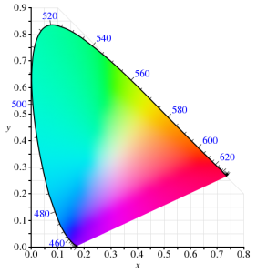
We learned back in elementary school that your eyes have rods and cones, that the cones allow us to see color, and that we can roughly see light with wavelengths between about 400nm (violet) and 700nm (red). We’ve got three types of cones – typically called Short, Middle, and Long based on the wavelengths they are most sensitive to. And while color in reality is pretty complex – an object will emit or reflect light at every wavelength we can see, just at a different level for each wavelength – all that matters to our brain is how much each cone in our eye responds to a given color, an effect called metamerism. Effectively, our cones turn a complex blend of light at different wavelengths into a set of three “tristimulus” values – in much the way that our tongue turns fancy food into measurements of how sweet, sour, salty, bitter, and umami something is.
In 1931, the CIE helpfully built a model for quantitatively representing any color that humans are capable of perceiving. It used a model similar to our cones for transforming any visible color spectrum into a set of three values (XYZ). The model is defined so that Y is close to how we perceive luminance (brightness), and normalized to create x and y values that reflect the ratios of X, Y, and Z. and thus, the color of something independent of how bright it is. Roughly, this is the CIE 1931 color space (from Wikipedia):
Since the very first color TVs, our technology has taken advantage of metamerism to use just three colors – typically red, green, and blue – to reproduce a much wider range of perceived colors. Good thing we don’t have 16 cones like the mantis shrimp, or a mix of red and green would seem nothing at all like yellow – forcing us to build many more primary colors into a display. Despite this, reproducing color accurately is still hard. First, there’s the shape above, which I heard cleverly referred to as “that darned curve that every engineer wishes was a triangle”; it reflects the nature of the cones in our eye, which make it impossible to reproduce some colors (e.g. pure 520nm light) with any combination of other colors. Second, while very pure color sources in our displays allow us to cover more of the visible range, current technology can’t easily produce pure colors. So to make our lives easier, we define color spaces that cover a subset of human vision, and are defined by three color primaries that we can produce (image from Wikipedia):
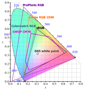
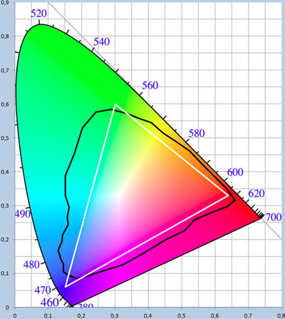
That small triangle in the middle that covers roughly 36% of what we can see? That’s the sRGB color space, and it is the dominant color space in almost all displays, digital photos, and digital video you’ll find today. Video standards like Rec.709 use the same color primaries; as far as I know, references to “NTSC” refer to Rec.709 and thus to the same colors. At first glance, sRGB seems depressingly small relative to our vision, to the point you’d expect displays to look terrible. Fortunately, much of what we can technically perceive doesn’t occur in our natural world. The color of almost all physical objects are based on what wavelengths of light they absorb, and no earthly substance can absorb all but a single narrow wavelength. The result is Pointer’s Gamut, which the linked article describes; it’s only modestly bigger than sRGB, and is shown via the black line below:
So when you look at a vivid alien world in Avatar and it seems like nothing you’ve seen on earth, it probably wouldn’t really look like that if it was real either :).
TVs, Displays, and Calibration
Limited though sRGB seems, most displays today are even more limited. When LCDs began to dominate over CRTs, they were only capable of covering roughly 70% of the sRGB color space – 25% of what you can theoretically perceive. The Dell WFP3007 I used until recently only had 72% sRGB coverage. Most budget monitors are also still at this coverage level – such as the HP 22cwa (the #1 monitor on Amazon), and essentially everything else in the sub-$300 category.
However, the last few years have seen much of the $500+ segment move to providing 100% sRGB coverage, and while still not that common, there are an increasing number of non-exorbitant “wide gamut” options that go beyond sRGB – covering some or all of larger color spaces such as AdobeRGB or DCI-P3 (which are almost 50% larger than sRGB). The new UHD Premium specification for TVs requires at least 90% coverage of DCI-P3, meaning we’ll see more and more displays with wide gamut support.
If you’re looking for a display or TV, should you always get as wide gamut a display as you can? Unfortunately, it depends. It definitely makes sense to ensure that you’ve at least got 100% sRGB coverage – this will do a good job rendering all content that’s out there, and most disc players, cable/satellite boxes, game consoles, PCs will simply assume that your display reproduces sRGB. But when you go beyond 100% sRGB – perhaps to a display that can show the full AdobeRGB or DCI-P3 color spaces – most content will appear over-saturated by default. Sure, you can turn down saturation or use “sRGB mode” if the display offers this, but in that case why get a wide gamut display at all?
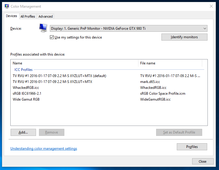
For computer displays, accurate yet wide color requires two things: installing or creating an appropriate color profile for your display, and use of color managed applications. On Windows, it is up to you to manually install a color profile for your display. On Windows 10, Display Settings > Advanced Display Settings > Display Adapter Properties > Color Management… (in the Color Management tab) will open the Color Management tool that allows you to add, remove, and choose the default color profile:
Of course, this assumes your display manufacturer provides an color profile (normally a “.icc” file) for your display. If it doesn’t, you can pick the closest standard color space. However, the better option if you really want the most accurate color is to build a profile for your display. This beats a manufacturer-supplied one, as every display is different and changes over time. Plus, the process of building a profile can help you optimize your display settings. To do this, you’ll need a colorimeter and calibration software that works with it. I bought the X-Rite i1Display Pro, though the less expensive Colormunki Display is probably equivalent. These are USB peripherals that sit on top of your screen and tell your computer what color is actually being displayed (photo is X-Rite’s):

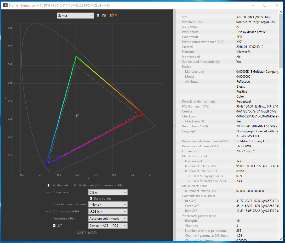
One word of advice: if you do go with X-Rite, don’t install their software. It’s truly terrible! In it’s default mode of operation, it didn’t help at all with adjusting settings on the display, created a ridiculous profile that attempted to do all white balance and output brightness adjustments on the computer by reducing the output levels of the RGB channels accordingly. This looked awful and created obvious clipping and banding in images. Worse, it somehow installed at the GPU level somehow, making it really unclear how to remove or reset this. Eventually, uninstalling their software, fiddling with some things, and rebooting got me back to the much better state in which I started. Fortunately, vastly better open source, DisplayCAL (and the underlying Argyll CMS software it uses) is available. It’s free, but it worked so well for me that I made a donation to contribute to its ongoing development.
One of the goals of calibration is to achieve a particular white point. This is important for any photo editing, or else once you get things looking right on your screen, the white balance will look off everywhere else. Calibrating to a 6500K white point will usually make sense. The DisplayCAL software was particularly helpful for getting this close using controls on the actual display, so that the connection between your computer and display can still use the full available range. Otherwise, creating a profile is surprisingly automatic, and at the end of the day, I had an accurate (hopefully!) .icc profile for my LG EG9600, and a better understanding of it’s coverage relative to sRGB:
Cameras and File Formats
What’s next after calibrating a wide-gamut display? Do you need a wide gamut camera to go capture this wider range of colors that your monitor can now display? Fortunately, the answer is no – unless you want a camera that can capture infrared images! Cameras don’t have the tough task of creating light at specific wavelengths; they only need to filter light, and that’s a much easier task. Even the digital cameras of 10 years were capable of capturing color well beyond what current displays are capable of reproducing.
However, this isn’t necessarily the case with file formats that the camera stores. If you shoot JPEGs, then your camera has to convert the very wide range of color that its sensor is capable of to one of the narrower color spaces that is appropriate for a JPEG. The most common of these is – you guessed it! – sRGB. Any colors in the original image outside what sRGB can represent get mapped to the closest matching color (which may not really be very close at all). Most DSLRs offer the option of recording in a wider color space, like AdobeRGB, but this has many issues of its own, as laid out in this fstoppers article on AdobeRGB vs. sRGB. One issue it doesn’t mention is that trying to represent more colors when you’ve only got 8-bits per channel to do so makes AdobeRGB more likely to result in banding (e.g. in the gradient of a blue sky). The biggest headache, though, is that you’ll likely need to convert the image to sRGB anyways before publishing or sharing it.
And if you’re going to do that, you might as well use RAW for this purpose. I’ve always thought RAW was the right choice, especially for non-photographers who make mistakes that RAW can help recover from. For color, RAW is vastly superior; it captures everything the sensor is capable of detecting, and doesn’t throw information out to produce a JPEG in a narrower sRGB space. Even if you don’t use this now, in 5 or 10 years from now you may see colors you never knew were being captured all along. Today, you’ll still export from RAW into sRGB JPEGs, but if you keep the original RAW images around, then when a wider gamut standard like Rec.2020 finally becomes commonplace even for images, you’ll be one automated re-export away from benefiting.
Color Managed Applications (and Services)
Does everything suddenly get more accurate as soon as you install that shiny new .icc profile? Sadly, not. Only applications that are color-aware will even pay attention to the fact a profile is installed at all. The significant majority of applications ignore it, and continue to crank out sRGB images that will look oversaturated when displayed using the full gamut that a wide gamut display offers. Things are apparently much better on Mac in this regard, but on Windows, just three applications I use have any form of color management:
- Adobe Lightroom. Since this is where I do all my photo editing, it’s really the only application that matters to me. I really do rest easier knowing that I’m not spending hours and hours editing photos solely to make them look better on my monitor. I know given the current state of the world that almost any photo I share will be viewed on an uncalibrated monitor, but since many of the photos I take now are for looking back later, I’m optimistic that this will make a difference on the highly color accurate display technology of the future :).
- Adobe Photoshop. I don’t use this, but it is certainly color aware!
- Web Browsers (partially). Outside of photos and games, virtually 100% of my time is spent in the browser, so in a way this is the only application that matters. Today, Chrome color manages JPEG images that have a color profile attached (but doesn’t manage untagged images, which is most of them). We’re hard at work making this better, so I’m optimistic that soon everything will be accurate! Firefox similar has partial color management. Safari is fully color managed. Surprisingly, both IE and Edge seem to entire ignore output display profile!
A feature of Lightroom I’d never used before is soft-proofing; it’s a feature designed to let you preview what output will look like. When in soft proofing mode, you can specify a target color space, and enable an out-of-gamut warning; this will show any parts of the image with colors that can’t be accurately represented using bright red (or some other color of your choosing). For example, consider this simple shot of Teh O Limau Ais (iced lemon tea at a Malaysia food stall):

The image you’re seeing was already converted to sRGB, as nothing else really works today. But how much of this image was out of gamut? As it turns out, quite a lot:

So, why not exporting JPEGs in a wider color space that preserves captured color at least to the extent that I see it when processing photos on my display? For starters, an 8-bit JPEG is going to produce more banding when used with a wide color gamut; a 10-bit+ image format is really needed to make this practical. But even if that wasn’t an issue, essentially every service – including SmugMug, which I use for hosting photos you see here – converts anything you upload to sRGB. In part, this is because the vast majority of web users have displays that are sRGB at best, and more typically 72% of sRGB. It’s also because web browsers historically didn’t properly handle images in non-sRGB color spaces and would display them washed out. While that’s largely no longer true – Edge, Chrome, Firefox, and Safari all handled ICC-tagged JPEGs – people do sometimes stay on old browser versions for a while.
Summary
So that was long and complex, but I think I’d summarize as follows:
- If you don’t edit photos or do color work, when you’re getting your next monitor, get something that’s 100% sRGB (or use your monitor in sRGB mode), but not wider. Unless you like unrealistically saturated colors, which you may!
- If you edit photos or really want accurate colors, consider a wide gamut display. But be prepared to invest in calibration, figure out which of your apps are color aware, make sure you’re shooting RAW, and have patience until file formats and the web catch up with you. If you’re shooting memories for the long term, it will pay off at least a little!
-
A New Monitor
I’ve long had a thing for lots of usable display space. For about eight years, I used two (and later three) 19″ CRT displays in a multi-monitor setup; this was sufficiently heavy that my desk would curve under the weight. Then, in 2007, a 30″ display I’d been eyeing – the Dell 3007WFP went on sale, and allowed me to replace my aging CRTs with one large LCD panel. I immediately disavowed multi-monitor configurations, significantly preferring a single large display. That monitor served me well for the last 8+ years, but in December I finally swapped it out. For something bigger – the 55″ LG EG9600:

Why the EG9600?
First things first; the EG9600 is not a monitor – it’s a 4K OLED TV that’s designed for your living room, not for your desk. OLED’s claim to fame is its image quality, in particular the black levels it is capable of producing. I’d been looking for a monitor for some time, but the things I wanted – IPS panel, 30″+ screen, 4K resolution, accurate colors with a wider gamut – never seemed to show up in a well-received product. It was also becoming clear that computer monitors were increasingly become a niche item that fewer companies were putting much effort into. I began to entertain the possibility of using a TV in this fashion, and after some research, decided on the EF9600 (flat) or EG9600 (curved). Several factors drove this decision:
- 4K was a fairly obvious requirement (since my prior display was already 2560 x 1600). CE devices sporting the 4K label are typically 3840 x 2160 as opposed to “true” 4K, but close enough.
- The ability to run at 60Hz with no chroma subsampling (aka 4:4:4) was an absolute requirement; many TVs don’t do this, because it’s not necessary for video – but it looks horrible on text. I was able to confirm that others were successfully doing 4K 60Hz 4:4:4 on the EG9600 over HDMI 2.0.
- I wanted a wider color gamut than the 100% sRGB coverage of typical LCDs; the LG OLEDs aren’t class leading but provide a decently wider gamut than sRGB.
- Great overall image and video quality were important, and as of mid-2015, many reviewers seemed to agree that the LG OLED models were class leading in this respect.
Ideally, I’d have liked a 40″ display – large enough to avoid text scaling, but small enough to be practical on my desk and to provide the increased pixel density I’ve gotten used to on the Chromebook Pixel or Retina Macbook Pro. Unfortunately, essentially all higher end TVs sold in North America seem to start at 50″; LG’s OLED lineup was no exception, with 55″ being the smallest display offered. This meant lower pixel density than my existing monitor (80ppi vs 100ppi previously). I decided I could sit a little further back and decided to take the plunge.
I still had to decide on the flat EF9600 vs the curved EG9600; both were priced identically, with no significant feature differences. I’ve made fun of curved screens in the past, joking that they seemed completely useless unless you want to sit right in the middle of the arc – which you’d have to sit two feet away from the screen to do. I never thought that was something I’d actually do, but here I am! Frankly, though, even at this distance I doubt there’s much difference.
Setup and Settings
Currently, 4K 60Hz 4:4:4 on a PC isn’t something you can realistically expect to work out of the box unless you’ve checked a few things. In fact, I’ve still been unable to make this work at all with either a 2014 retina Macbook Pro, or with a Dell XPS 13. Fortunately, neither of those devices is my primary PC! Still, even my desktop required four manual steps to get things to work acceptably:
- HDMI 2.0. Computer displays almost always use DisplayPort 1.2 to support 4K/60. TVs typically don’t support DisplayPort at all; the EG9600 is no exception to this rule with just three HDMI ports. Many laptops have HDMI ports, but even new ones are typically just HDMI 1.4 and thus limited to 30Hz. Even discrete graphics cards that aren’t fairly new will typically lack HDMI 2.0. In my case, I replaced a Nvidia GTX 660 with a newer GTX 980Ti; this provided both HDMI 2.0 and the increased GPU horsepower needed for gaming.
- TV Input Settings. TVs don’t default to the optimal settings for a computer display. Fortunately, a forum post by someone who blazed this trail before I did provided the essential details: in the TV settings menu, enable HDMI Deep Color, change the name of the input to PC, change the icon to a computer, set aspect ratio to “Just Scan”, and use HDMI 1 or 2 (but not HDMI 3 which seems to have a lower bandwidth limit). I also found it helpful to set sharpening to zero, and to disable all processing/dynamic features that were offered (I’ll say more about color later).
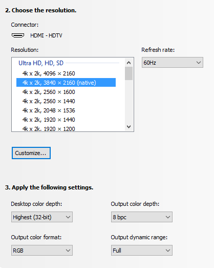
- PC Output Settings. This depends on your graphics card; below is an image from Nvidia’s control panel tool. Two settings are very important – and were incorrect by default! The first is the output color format; RGB is optimal, and settings like YUV420 which are common for TVs will make text look terrible. The second is the output dynamic range, which defaulted to Limited; this is also typical for video. If you’re lucky, you’ll notice right away because blacks are dark grey, and whites are light grey. If you’re unlucky, your TV will detect this, stretch the limited signal from your PC back to full range, and you’ll get reduced image quality forever without noticing this. Nvidia resets this when you update the driver, so check once in a while!
- Prevent Position and Size Changes. This was the toughest issue to solve. Every time I powered the screen on, all my windows were repositioned to the top left of the screen, and shrunk to a fraction of their size, as if the display had cycled through a lower resolution as part of its startup sequence. This was a problem for a long time on Windows 7/8, so there were lots of suggestions including registry edits, but none of them seemed to work. What I discovered by using Chrome Remote Desktop to connect to my machine while the display was off was that the resolution was correct – but the scale factor for text was set to 300% (vs. 100% normally when the display is on). Changing this was ineffective; it’d still reset every time. Going to Control Panel > Appearance and Personalization > Display, clicking on the not-recommended “set a custom scaling level”, and choosing 100% finally fixed this! I also did this (2nd post on snapping), in case the combination is what really corrected things.
Remaining Issues
Although core functionality and some of the bigger initial issues were resolved with the setup and settings above, there’s a number of lingering annoyances for which I’ve found no solution:
- There is no traditional sleep state. My computer turns off the display after a few minutes of activity, the EG9600 detects this as “no input” and shows a corresponding “no input” message for another ~5 minutes before powering off. That’s no big deal; the problem is that it can’t power back on automatically (e.g. when you move your mouse). So every time I sit down, I have to manually power the display on. I’d complain more but I remember how long it took to power on your PC in the Windows 3.1 days :).
- The EG9600 has a non-defeatable (as far as I know) dimming function when it detects that on-screen content is not changing – presumably to prevent persistence (burn-in). The issue is that it’s looking for big changes – so when you’re typing an E-mail or reading a static web page, it gets gradually dimmer until a change is detected at which point you’re hit with full brightness. Bringing up the Alt-Tab switcher occasionally defeats this, but it is pretty annoying. Fortunately, it doesn’t affect photos, videos, or games – just text work.
- There is indeed a little display persistence with static content; you’ll see a lingering version of content you leave up for a long time when switching to a grey screen. In practice, this has been a non-issue for me, and things don’t persist for long once the screen changes.
- Although viewing angles are generally great with OLED, there is a small color shift as you move from side to side; images look warmer when viewing head on, and cooler from the side. This is also more or less a non-issue unless you’re editing photos with someone else or like to swing your head from side to side as you work.
The dimming issue is by far the largest of these; the power issue is a minor inconvenience, and the other issues don’t bother me at all in practice.
Was it worth it?
Pros:
- 4K delivers a nice bump in clarity. Sure, 4K video looks great – and at 2-3 feet away, the added detail is easily visible. But it’s photos where this really shines; for years, every camera and even many smartphones were capturing images at higher-than-4K resolutions – now it’s possible to appreciate more of that detail.
- Colors look great, with the EG9600 supporting a gamut that’s about 88% of DCI-P3 (and a decent bit beyond still-typical sRGB displays).
- Black levels truly are amazing. I can’t see the transition between the screen and the bezel with dark content. I never appreciated the impact this has on overall image quality until I got used to the EG9600, and it’d be really tough to go back.
- Size. 55″ of screen real estate does reduce pixel density, but in my opinion is a net plus. as it lets you run without scaling anything up, providing a massive amount of working area in the process. Lightroom’s entire toolbar pane will often be visible onscreen without scrolling. I can work on things side-by-side and still have a video visible. You can lean in to take a look at something up close, or lean back to appreciate the entire image.
At night without light, blacks are sufficiently black that on some images you can’t see the edges of the screen. This is with no processing of the image from my camera:

Cons:
- Without a modern GPU with HDMI 2.0 support, you’re likely to have a bad time, and be stuck at either 30Hz or with 4:2:0 chroma subsampling.
- A number of TV vs. monitor design differences persist, with the dimming issue being the most annoying in actual use. If you mainly do text work, this could be a deal breaker.
- Size. I mentioned this as a plus above, but any 55″ TV is going to dominate your desk, and for tasks like E-mail or documents, you’ll likely be using a tiny fraction of the available space.
- Cost. Despite significant price drops late last year, OLED is still very expensive; only rationalizing that I spent about 10,000 hours in front of my last display allowed me to remotely justify this.
For me, the LG EG9600 is definitely an improvement over the 30″ Dell that served me well for over 8 years; I love it and I plan to stick with it for quite some time. However, unless you spend a good portion of your time on photos, videos, or games, there’s probably better options for most. If you do go this route, make sure you’ve got HDMI 2.0, a capable GPU, and a willingness to accept the limits of using a TV!
-
More Things I Use
Besides the Sigma 50mm f/1.4 Art I mentioned a few posts ago, and monitor/home theater changes I’ll mention separately in the future, there’s a number of other things I started using over the past year or so. Here’s a few notes on those things!
HIFIMAN HE400S

This purchase was one born entirely from curiosity, as there’s truly nothing wrong with the Sennheiser HD-595 open headphones that I’ve historically used. Indeed, this was a particularly wasteful purchase because I only occasionally use headphones now that my computer is tucked away in the basement, inaudibly far from where anyone might be sleeping. The big draw for me with these particular headphones is that they’re electrostatic, like the Magnepan IIIs I’ve used for a couple of decades now and have been a fan of for music listening. Past electrostatic headphones were uber-expensive ($1000+), so when these came in at the “low” price of $299, I indulged and picked up a pair. I don’t try enough headphones to accurately review how these fare against anything else on the market, but I do prefer them over my 8-year old HD-595s and to my ears, they sound great and are the best I’ve heard in this category. I don’t know I could call a winner between these and my ER-4PT earbuds; the earbuds benefit from blocking out all background noise, but the open circumaural design on the HE-400S is much more comfortable to me for extended listening.
SVS SB12-NSD

I’ve used a full sized subwoofer in my computer audio setup for about 16 years, largely because of a “deal” back in 2000 that wound up with me owning multiple Advent AV-550S subwoofers at a low price. A few years ago, I replaced the one in our home theater setup with an SVS PB12-NSD. While it was a little smaller than the 15″ AV-550S, it was significantly clearer and represented a significant step up in overall quality. This always tempted me to also update my PC setup, but it seemed a little wasteful to get a nicer subwoofer just for a PC setup. However, in late 2015, the SB12-NSD (a sealed version of the PB12-NSD) went on final closeout, having been replaced some time ago by newer models. I was so happy with the PB12-NSD upgrade that I couldn’t pass the chance up!
First off, I was pretty wrong in thinking this wouldn’t make a big difference in my PC setup. In retrospect this is obvious, but because I use smaller bookshelf speakers in my PC setup compared to the HT setup, the sub is actually much more important since it’s actually handling a greater portion of the overall audio spectrum. In any case, the upgrade was very worthwhile; unexpectedly, I actually have a greater tendency to listen to music while working at my desk than before, and it’s a much closer experience to the bigger speakers elsewhere in my home.
I also learned something I wish I’d known earlier about setting phase on a subwoofer, which historically I’d always done via trial & error with no confidence I was making any real difference. A forum post somewhere recommended simply playing an 80Hz test tone (or whatever crossover frequency you wish), using an SPL meter (or your ears) in your main listening position, and tuning phase to maximize amplitude. Subjectively, it feels like that approach worked really well, even with the $17 SPL meter I use.
Canon Pixma Pro-100

I’ve been on the fence about getting a photo printer. It’s generally not necessary, because Costco and others will happily use a high quality printer on whatever you care to send them, and they’re just a few minutes from my home. Two things finally got me to pull the trigger on this. The first was a rebate from Canon that effectively reduced the price of this printer to $200 (half it’s normal price). The second was looking into color gamut, and realizing that the color gamut (range of colors that can be represented) is higher for my camera, this printer, and monitor than it is for the (sRGB) JPEGs that any consumer photo service is willing to accept. In other words, exporting my photos to JPEG and sending them to Costco meant a loss of certain colors that their printers (and now mine) would actually be fully capable of reproducing.
Is this difference visible? I honestly haven’t done enough testing to know yet, but for 50% off, I was willing to experiment. It’s half worth it just to install all the ink cartridges, each of which gets has its own impressive glowing LED once properly installed:

P.S. the LEDs in that picture are a good example of a color that’s out of gamut, which is partially way the image above doesn’t look as nice as the real thing :).
Tamrac JETTY 7

I already have a fairly crazy number of camera bags, each of which seems to serve a different purpose. The Think Tank Digital Holster 40 is great when I’m bringing just one lens; the Lowepro Rezo 180AW worked well with a few smaller lenses (not the f/2.8 zooms) plus a flash but was a bit bulkier to carry around; the Tamrac Rally 7 is still the travel bag I use all the time when I need to bring a 15″ laptop, my D800, and several large lenses. Amazingly, this still left me wanting a bag that was as unintrusive as the Think Tank, but sufficient to carry a pair of smaller lenses. The Tamrac JETTY 7 turned out to fit this bill quite well – it decently holds the D800, a couple of full frame primes (one attached to the body), a small flash (in the front compartment) – and even a tablet, though I never bring one:

I tried this bag mainly because it was on sale at Costco, but I now use it regularly – though amazingly, I do so alongside all three of the other bags mentioned, which still see active use!
Motorola Nexus 6

Valerie completely the destruction of her Nexus 4 about a year ago, so I needed to either get her a new phone, or give her my Nexus 5 and switch to something else. I decided to try the Moto Nexus 6 to see how I felt about the oversized phone thing. I find it… a little oversized. The increased screen real estate is nice, but no amount of getting used to the phone will increase the size of my hand. In any case, there’s plenty of material out there on this and every other phone, and 12 months later it’s old news, so enough said on this!
-
Cancelling Amazon Prime… and saving money

One of the first things I did when we moved to the United States was to subscribe to Amazon Prime. The early days especially were a non-stop flurry of boxes from Amazon, containing all the things we thought we needed as we transitioned from living in a relatively smaller high-rise condo, to a much larger single family home.
Almost exactly four years later, we cancelled our Prime subscription. I’ll share the reasons why below, but it had an unexpected side effect – saving money. I’m not just talking about the $99/year subscription fee either.
Why Cancel?
Given my affinity with Chromecast, the straw that broke the camels back is going to be fairly obvious – but in truth, a number of things had already happened that gave me increasing concern about the nature of being a Prime member. These were roughly as follows:
- Service Bundling. When Amazon raised the price of Prime from $79/year to $99/year, they justified it by the “extra services” they had recently added – by which they mean Prime Instant Video, their competitor to Netflix (and later, Prime Music). This was simply a service I didn’t want, and never used. The incremental content it provided over Netflix at the time was minimal (and Netflix had the kids programming and a kid-friendly UI that we depended on), and the interface for actually finding anything was poor. To me, there was zero reason to bundle two completely unrelated services – free shipping on physical purchases, and online streaming video/music. Ultimately, I rationalized that the convenience of fast, free shipping alone justified the $99/year, and stuck with the service.
- Hachette Books Dispute. I don’t even buy books, generally speaking, but the tactics of holding physical books hostage in negotiations over ebook pricing seemed a little questionable. I don’t really know enough about the issues on either side to comment on who was really right or wrong in this dispute, but it did make one thing clear – Amazon knew that I, like others, was a captive audience (as opposed to a group that would simply buy elsewhere if Amazon didn’t carry something), and was using this as a negotiating tool.
- Movie Studio Dispute. One category of items I’ve consistently purchased via Amazon is movies and videogames, as they’ve got a great policy of having it to you on release day, at the lowest price the item had any time between when you ordered, and when it shipped. Despite the convenience of streaming, when I really care about watching the film in the highest quality I can, I still buy the Blu-ray disc. Then something very odd happened; the release date of something I’d been waiting for was coming up, yet the item wasn’t even visible on Amazon for pre-order. While there wasn’t a lot of press around this, what did exist pointed to an ongoing negotiation between Amazon and the studio for this film (I don’t remember which it was). I finally did pre-order it, with the usual promise of release day delivery. But disappointingly, release day came and went, and that weekend, I had to skip watching the film despite it being available at Costco for the same price, because it was already in transit from Amazon. It felt like a worse outcome for me, so that Amazon could strike a better bargain.
- Banning Chromecast (and Apple TV). This one hit far closer to home, but also – in my likely biased opinion – crosses way many more lines than the above. If you didn’t see this, Amazon decided to remove both Chromecast and Apple TV, on the basis that it was “confusing” to their customers that these products did not work with Prime Instant Video. As some articles pointed out, this argument didn’t make a lot of sense; Chromecast (and now also Apple TV) allow app developers to support the device if they so choose. More importantly, this was a very clear sign that Amazon didn’t actually intend to be “the everything store“, and that it would favor its own products over others. Chromecast might have been the first publicly visible example of this, but what about the Amazon Basics products I’d bought – were competitors against Amazon in other areas being treated similarly?
The net of all this is that Amazon lost the trust I once placed in it to act in its customers’ interests first and foremost, and to be a great source (even if not the absolute cheapest on everything) of anything I wanted to buy online. Moreover, I didn’t want to buy a “buys-everything-on-Amazon” Prime subscriber that allows them to make moves like the above that are only in their own interests.
Saving Money
In cancelling Prime, I expected to save $99/year, at the cost of waiting a few extra days for my purchases, and not being able to impulsively order something that cost $5. Entirely unexpectedly, I’ve saved far more than that. You might be expecting a noble tale about how this led to an epiphany about the plague of excess consumerism, but unfortunately while we do definitely buy way too much stuff as a society, I don’t have such a tale to tell. My experiences with not defaulting to Amazon are actually quite different:
- Some things are just cheaper elsewhere. Amazon offers good prices and never tries to float a price that’s a ripoff compared to other sources, but it’s not always the best. Once my shopping tended to start with search instead of on amazon.com, I found that I’d occasionally get the best deal on what I wanted with B&H Photo, Monoprice, Newegg, or some other source. It’s a little more hassle to have accounts with various sellers, but not being lazy had some benefit.
- Brick & mortar makes sense for some items. In the early days of e-commerce, retail stores generally still had margins that ensured that buying online was virtually always a better deal, unless you picked up a loss leader on Black Friday. But that’s changed, and retailers now understand they can’t sell non-impulse items at higher-than-online prices. In fact, for some items, the manufacturer dictates the same price across both online and offline sellers. This was the case with an LG OLED TV that I bought to replace my monitor; Amazon, Best Buy, and other sources all had identical prices (technically, Amazon had it for $2 less). Purchasing it in an actual Best Buy came with three benefits. First, I had it home and setup the day I hit a particular personal goal I’d gated this decision on. Second, we could choose when to go to the store, rather than having to set up a 4-hour delivery window (or greater), probably on a weekday, that would have been inconvenient. But finally – and per the “save money” comment – a promotion to sign up for a Best Buy Visa led to a 10% discount, which in the case of this TV made a $300 difference!
- Minimum advertised price is not minimum price. In some categories, retailers seem to be held to a requirement that the prices they can post/offer online have a certain minimum. I’d previously assumed that this was just “the price”, and if it seemed reasonable enough I’d buy it from Amazon. But as I looked at replacing two key components of our home theater that have provided close to a decade of service but are getting somewhat dated, I discovered that A/V dealers you still have to call over the phone can still do better than “minimum advertised price”, even when they are authorized dealers. My replacement projector was $200 less from a dealer than from Amazon; the updated A/V processor I went with was $250 less through that dealer. The right dealer will also be very knowledgeable; I actually wound up making a different choice on the projector after speaking with the dealer and doing some additional research.
It’s hard to quantify the small items, but the three big-ticket items (which I hope will last a decade, like their predecessors!) added up to $850 in savings over my previous “Buy with 1-click” default behavior. And so far, we’ve only had to pay $5 once for expedited shipping. Add in the $99 annual fee, and that’s a net improvement of $944 not counting smaller items!
Amazon is still a great source of many things, and whenever I’ve had to reach out to their customer service, they’ve been great. When I am buying something online, I don’t avoid shopping there, and I’m glad that by going to smile.amazon.com, you can elect to support a charity with a small portion of your purchases. Cancelling Prime just means I don’t default to shopping there – and so far, that’s saved me a ton.
-
Lighting!
Four and a half years ago I wrote a post, Umbrellas are for rain!, and shared a few photos that Wen and I took outside using regular Nikon flashes with a shoot-through umbrella to diffuse the light. It did certainly cross the line of not taking photography too seriously, but only by a little; after all, it’s just an umbrella!
My use of flash has decreased since then, from 33.5% at the time (with the D7000) to just 21% in 2015 (with the D800), in part because the full frame D800 can produce decent results even in fairly low light (even though it doesn’t hold a candle to something like the much newer D5). At the same time, the lighting equipment I have available jumped into the truly ridiculous category (given that I still don’t think of myself as a photographer). This was all thanks to gifts from my mom and Sugawara San, not due to my own going crazy!
elinchrom D-Lite 2

The elinchrom D-Lite 2 is an AC-powered studio flash unit. It’s 100% manual; you’ve got to set exactly the power level you want, connect it to your camera with a cable, and it will fire every time you press the shutter button on your camera. It works just as well with old film cameras as it does with modern DSLRs, but if you’re used to your flash automatically figuring out what the right power level is, then a unit like this will take some getting used to!
A pair of these came in a kit together with a softbox and a stands. The softbox reflects and diffuses the light from the flash head itself, and creates a much bigger effective light source if you’re close to the object you’re taking a picture of. Once assembled, the setup looks like this:

I now use these almost anytime I’m taking a picture of the types of things I post here – since I almost do those things at night when there’s no light available. The manual operation seems a little daunting at first, but once you’ve used them once or twice it’s actually pretty easy since you’ll use the same settings basically every time. These are often used for portraits and the like, but since everyone here is asleep I took a picture of a really old dusty toy instead:

Zoids! I doubt anyone remembers those, but it was great to build them up out of smaller parts back in the 80s:

At first glance, it must seem ridiculous and expensive to get studio equipment – but it is surprisingly affordable. For instance, if you just want to experiment, B&H sells a brand new, reasonably reviewed kit for $127, which includes the flash unit, softbox, and stand, and cable. That kit has a 100W/s flash, as compared to the 200W/s D-Lite 2 – but I almost never use the D-Lite 2 above half power – and 100W/s is a good bit more than almost any camera-mounted flash. It’s also much cheaper than a TTL flash of similar power from your camera vendor, despite having a stand and softbox. It’s not for everyone, but if you take lots of indoor pictures I’d definitely recommend giving it a try!
Bowens esprit 2
If the shopping trip to Glazers that picked up the elinchrom kit had ended with the above, that would already have been well beyond my needs. But, there was an apparently “great deal” on something that goes so far beyond what I need (especially given the low noise levels on current digital cameras) that I have basically never used it. That deal was on a Bowens espirit 2, which is a 1000W/s light cannon that allows you to engage the sun in direct combat:

I’m not kidding about the sun thing; 1/10th that power is already enough to take pictures at ISO 100 f/8, but if you want to get rid of those pesky shadows for a subject that’s actually standing out in the sun, then this thing is your ticket. It’s also theoretically useful if you’re taking group photos, and need to cover a wider area in light. Just don’t point this thing directly at people or you’ll blind them! You really have to use a reflecting or shoot-through umbrella.
Firing this thing at full power really makes you feel like you’re already part of a Type II civilization. Or a Star Wars villain, cranking the power to 100%, waiting for the green light to indicate that it is fully charged, and then pulling the trigger to blow away some unsuspecting victim.

Yongnuo RF-603N
Manual flash cables are kind of a pain, so it was great to discover the Yongnuo RF-603 radio transmitters! Whereas fancy RF units that support Nikon or Canon (or other’s) TTL systems (where the camera and flash figure out the right exposure for you) cost around $200, a pair of these go for just $27!

These small battery powered devices are actually really versatile and useful, and I highly recommend them. You can do any of the following with two or more units:
- Connect one unit into your camera’s remote release (using a cable like the one shown on the right), and use the other to remotely trigger your camera. This seriously beats setting a timer and running back into a group shot, and it’s way cheaper than what your own camera maker will try and sell you, plus it is radio frequency so you don’t need to point at the camera and look foolish in your own picture.
- Put a unit in your camera hotshoe, and trigger any hotshoe-based flash (like the one you may already own) remotely. If your camera/flash don’t have built in features for remote operation, this is a really cheap way to get this capability – though it does require that you can set power on your flash manually (or that it defaults to max power). This also lets your synchronize multiple flashes.
- Same as the above, but attaching a PC sync cable to fire flash units like the two I mentioned above.
The nice thing about the RF-603 is that the shutter release vs. flash release are independent signals, so you can do two of the above concurrently! This allows a single unit to be used in your camera both to trigger the shutter and to remotely fire a flash.
Power Comparison
Just for fun, I took a few comparison shots that illustrate the power levels of different flash options. All of these are at (or adjusted to) ISO 100, f/5.6. I used the following:
- D800 built-in flash
- Nikon SB-400, the first flash I ever purchased. The main benefit it adds is the ability to bounce off the ceiling.
- Nikon SB-800, a larger unit that uses 4 AA batteries and has been my primary flash for many years.
- elinchrom D-Lite 2
- Bowens esprit 2
First up, the D800 built-in flash. Unsurprisingly, at ISO 100, it lacks the power to light things up even at f/5.6:

Next, the Nikon SB-400, which actually had slightly less output (but perhaps a little more dispersion):

Finally, the SB-800 started to deliver enough power to brighten things up a bit. I think it’s equivalent to about a 90W/s, so you’d expect this. Of course, when operating the SB-800 at full power, you have to wait a long time for it to recharge:

The elinchrom D-Lite 2 has similar apparent brightness, but only because it had much wider dispersion; you’ll notice that more of the background is visible than with the SB-800. It’s roughly twice the power of the SB-800, but also recharges quicker at full power due to having AC power:

Finally, the Bowens really lights things up – you can see much further into the forest behind the garden area. The photo understates how blindingly bright this was, especially at night. It also shows how anything even remotely near the Bowens will be over-exposed, even at ISO 100, unless you stop down to at least f/8 or so:

Take that, sun!
-
Sigma 50mm f/1.4 Art
Somehow, I managed not to post a single thing in the entirety of last year! Switching roles at work, a permanent backlog of photos to be processed that took me till this year to get through, the manual labor to refresh our home theater room – there just never seemed to be the time. Not that this year is likely to be any different!
One thing I’d put off from 2014 was mentioning a lens I picked up that year, the Sigma 50mm f/1.4 DG HSM Art:

A 50mm standard prime is normally considered pretty “boring”; it generally can’t do close ups with nice background blurring, nor can it capture panoramic landscapes. Nonetheless, it’s one of the most common primes on a full frame sensor (with 35mm being equivalent on a 1.5x crop camera). In fact, my own tendency to use primes started with the Nikon 50mm f/1.4 AF-D back in 2009; after seeing the improvement in image quality over my 18-200mm superzoom, I started leaning much more heavily towards primes.
Despite the Nikon 50mm kicking off this trend, I didn’t ultimately use it that much. The fabulous, inexpensive Nikon 35mm f/1.8G was a better match for the crop cameras I used until 2012, and by the time I went full frame, I’d picked up the Nikon 24-70mm f/2.8G AF-S; it didn’t have as wide an aperture as the Nikon 50mm, but it had superior optical quality and focus speed/accuracy despite being a zoom lens.
So it was a bit of a gamble when Sigma introduced the 50mm “Art” lens pictured above. It had a number of fabulous early reviews, and amazing sample shots even when used at f/1.4 or f/2.0, but it was unclear whether I’d wind up preferring it over the 24-70mm that was seeing the most usage at that time. To keep things short: it did, and I kept more shots with this lens – 30% of what I took in 2015 – than with any other.

The image above is from a visit to the Batu Caves in Malaysia; there’s lots of monkeys roaming around, in some cases looking for things they can snatch from unaware passers by! There was an extremely strong backlight – the monkey isn’t against a totally white background because I lured it into a studio or as a result of heavy editing. Normally this would cause flare galore, and a strong lost of contrast – especially when shooting at f/2.8 as in the above photo. But despite the worst of conditions, the Sigma managed an image that I really like.

The above is also from Batu Caves, and shows the incredibly strength of a bunch of red ants that were carrying this dead cockroach back towards their nest. Amazingly, the ants you see pictured here were able to lift that massively bigger carcass up a vertical stretch, at least until gravity won out and destroyed their progress; it was pretty amazing teamwork nonetheless. In any case, the Sigma 50mm is no macro lens but it’s sharpness even at wide apertures – this one is also f/2.8 – coupled with the high resolution of the D800 makes it possible to capture some pretty small things without dragging a dedicated macro lens around.

Even at f/1.4, as in the above shot, the detail in the very narrow band that’s actually in focus at that aperture is just incredible. The Nikon 50mm would lose contrast and sharpness across the entire frame if you had to use it wide open; that wasn’t the case here, and the bokeh feels very nice to me especially for a standard prime.
Every lens has drawbacks, and for the Sigma, that’d be weight and price; its very solid construction yields an 815g lens that is very close to the weight of the 24-70mm zoom, and at $950 it’s significantly cheaper than Nikon’s high-end 58mm f/1.4, but significantly more expensive than the $350 it cost for my older Nikon 50mm f/1.4 (or Sigma’s own non-Art version of the same). Still I’m completely without regrets in having picked up this lens!

-
Progress
My first home in Kuala Lumpur, Malaysia, which we lived in when I was 6 through 9 – along with my grandparents, aunts, uncles, and cousins – was demolished long ago. Although my mom’s generation had grown up there, the transformation of KL since the 50s made the land far more useful even as a downtown parking lot. Ironically, decades after it’s destruction, the land remained undeveloped – a fact we regularly observed while eating at the tea shop across the street from our original home. I’ve eaten more meals in this tea shop than in any other restaurant, bar none:

Indeed, we just had some roti in that shop this morning – and it’s basically open around the clock, so whether it’s lunch at 1pm or a late night snack at 1am, you’re covered. Even if you’re feeling for something like Maggie Goreng – basically, fried instant noodles – that you probably won’t find outside Malaysia:

Epitomizing the “cultural melting pot” label Malaysia sometimes gets, this mostly-Indian teashop, frequented largely by local Malays, shared their space with a Chinese vendor who has known us since childhood, and that we know only as “Fruit Juice Lady” – and who still refers to me as “Boy”. Sadly, I learned today that she’s closed up shop after a few decades to take care of her diabetic father.

The reason we ate here so frequently is that after our first home, we moved just around the corner – to a low-rise “flat” that was home from age 9 through 12 and whenever I visited over the ~25 years since I left Malaysia. Each visit, it was stunning to see the modern high rises popping up all around us, starting with the Petronas Twin Towers, and continuing at an unrelenting pace. From any angle, our 5-story flat was surrounded by towering skyscrapers:


Our building (“Flat Jalan P Ramlee”) is completely obscured in Google Maps satellite imagery – even though that imagery is a few years old and is missing a new skyscraper on the other side of the street from us:

If you came across our old building, you’d definitely think – rightfully – that it was a relic of the past. Employees at the office on the first floor punched in and out daily on this:

The back entrance was indeed a little dilapidated:

If you’ve never lived in Asia, you might be forgiven for assuming that our front door looked like a prison:

It’d be valid to wonder why a bulldozer hadn’t wiped out our anachronistic home – and indeed, after that question being asked any number of times, our home’s time was finally up. I took these photos a year ago, in December 2013; the building was demolished a few months ago. Today, I returned for the first time to see an empty lot, surrounded by metal panels, where our home used to be. This fruit tree, which I’d planted from a seed as a child – and which even the subsequent creation of some parking spaces had spared – was cleared away along with everything else:

I suppose the price of progress is that sometimes, it involves the demolition and paving over of your childhood memories. But that’s why I carry my camera, and keep this blog! Now, my mom lives out in the suburbs; the twin towers no longer cast a shadow over us, but they’re still visible from here, on a clear night like tonight:


The skyline may not look any different with our tiny little home missing, but it all depends on your vantage point.