Photography
-
Learning About Color
Over the past half year or so, understanding color and how it’s handled digitally became much more important to me. I even understand how to spell it the American way now! Some of this was related to my work, where handling video content in different color spaces is becoming increasingly important, especially with the emergence of new standards around UHD Premium and HDR. However, for personal use – choosing a monitor, editing photos, sharing them – an improved understanding has helped significantly as there’s an unfortunate and unsettling set of tradeoffs in digital color handling. I’m still no expert, but here’s what I’ve learned that’s relevant in personal use.
Color Fundamentals
We learned back in elementary school that your eyes have rods and cones, that the cones allow us to see color, and that we can roughly see light with wavelengths between about 400nm (violet) and 700nm (red). We’ve got three types of cones – typically called Short, Middle, and Long based on the wavelengths they are most sensitive to. And while color in reality is pretty complex – an object will emit or reflect light at every wavelength we can see, just at a different level for each wavelength – all that matters to our brain is how much each cone in our eye responds to a given color, an effect called metamerism. Effectively, our cones turn a complex blend of light at different wavelengths into a set of three “tristimulus” values – in much the way that our tongue turns fancy food into measurements of how sweet, sour, salty, bitter, and umami something is.
In 1931, the CIE helpfully built a model for quantitatively representing any color that humans are capable of perceiving. It used a model similar to our cones for transforming any visible color spectrum into a set of three values (XYZ). The model is defined so that Y is close to how we perceive luminance (brightness), and normalized to create x and y values that reflect the ratios of X, Y, and Z. and thus, the color of something independent of how bright it is. Roughly, this is the CIE 1931 color space (from Wikipedia):
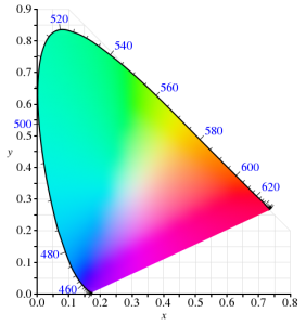
Since the very first color TVs, our technology has taken advantage of metamerism to use just three colors – typically red, green, and blue – to reproduce a much wider range of perceived colors. Good thing we don’t have 16 cones like the mantis shrimp, or a mix of red and green would seem nothing at all like yellow – forcing us to build many more primary colors into a display. Despite this, reproducing color accurately is still hard. First, there’s the shape above, which I heard cleverly referred to as “that darned curve that every engineer wishes was a triangle”; it reflects the nature of the cones in our eye, which make it impossible to reproduce some colors (e.g. pure 520nm light) with any combination of other colors. Second, while very pure color sources in our displays allow us to cover more of the visible range, current technology can’t easily produce pure colors. So to make our lives easier, we define color spaces that cover a subset of human vision, and are defined by three color primaries that we can produce (image from Wikipedia):
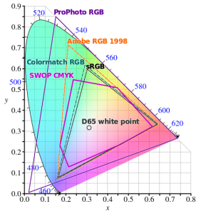
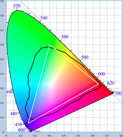
That small triangle in the middle that covers roughly 36% of what we can see? That’s the sRGB color space, and it is the dominant color space in almost all displays, digital photos, and digital video you’ll find today. Video standards like Rec.709 use the same color primaries; as far as I know, references to “NTSC” refer to Rec.709 and thus to the same colors. At first glance, sRGB seems depressingly small relative to our vision, to the point you’d expect displays to look terrible. Fortunately, much of what we can technically perceive doesn’t occur in our natural world. The color of almost all physical objects are based on what wavelengths of light they absorb, and no earthly substance can absorb all but a single narrow wavelength. The result is Pointer’s Gamut, which the linked article describes; it’s only modestly bigger than sRGB, and is shown via the black line below:
So when you look at a vivid alien world in Avatar and it seems like nothing you’ve seen on earth, it probably wouldn’t really look like that if it was real either :).
TVs, Displays, and Calibration
Limited though sRGB seems, most displays today are even more limited. When LCDs began to dominate over CRTs, they were only capable of covering roughly 70% of the sRGB color space – 25% of what you can theoretically perceive. The Dell WFP3007 I used until recently only had 72% sRGB coverage. Most budget monitors are also still at this coverage level – such as the HP 22cwa (the #1 monitor on Amazon), and essentially everything else in the sub-$300 category.
However, the last few years have seen much of the $500+ segment move to providing 100% sRGB coverage, and while still not that common, there are an increasing number of non-exorbitant “wide gamut” options that go beyond sRGB – covering some or all of larger color spaces such as AdobeRGB or DCI-P3 (which are almost 50% larger than sRGB). The new UHD Premium specification for TVs requires at least 90% coverage of DCI-P3, meaning we’ll see more and more displays with wide gamut support.
If you’re looking for a display or TV, should you always get as wide gamut a display as you can? Unfortunately, it depends. It definitely makes sense to ensure that you’ve at least got 100% sRGB coverage – this will do a good job rendering all content that’s out there, and most disc players, cable/satellite boxes, game consoles, PCs will simply assume that your display reproduces sRGB. But when you go beyond 100% sRGB – perhaps to a display that can show the full AdobeRGB or DCI-P3 color spaces – most content will appear over-saturated by default. Sure, you can turn down saturation or use “sRGB mode” if the display offers this, but in that case why get a wide gamut display at all?
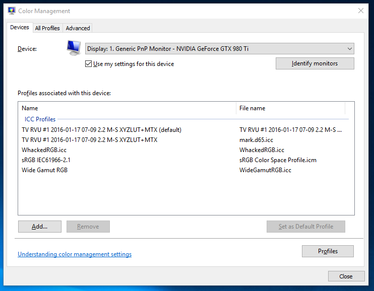
For computer displays, accurate yet wide color requires two things: installing or creating an appropriate color profile for your display, and use of color managed applications. On Windows, it is up to you to manually install a color profile for your display. On Windows 10, Display Settings > Advanced Display Settings > Display Adapter Properties > Color Management… (in the Color Management tab) will open the Color Management tool that allows you to add, remove, and choose the default color profile:
Of course, this assumes your display manufacturer provides an color profile (normally a “.icc” file) for your display. If it doesn’t, you can pick the closest standard color space. However, the better option if you really want the most accurate color is to build a profile for your display. This beats a manufacturer-supplied one, as every display is different and changes over time. Plus, the process of building a profile can help you optimize your display settings. To do this, you’ll need a colorimeter and calibration software that works with it. I bought the X-Rite i1Display Pro, though the less expensive Colormunki Display is probably equivalent. These are USB peripherals that sit on top of your screen and tell your computer what color is actually being displayed (photo is X-Rite’s):

One word of advice: if you do go with X-Rite, don’t install their software. It’s truly terrible! In it’s default mode of operation, it didn’t help at all with adjusting settings on the display, created a ridiculous profile that attempted to do all white balance and output brightness adjustments on the computer by reducing the output levels of the RGB channels accordingly. This looked awful and created obvious clipping and banding in images. Worse, it somehow installed at the GPU level somehow, making it really unclear how to remove or reset this. Eventually, uninstalling their software, fiddling with some things, and rebooting got me back to the much better state in which I started. Fortunately, vastly better open source, DisplayCAL (and the underlying Argyll CMS software it uses) is available. It’s free, but it worked so well for me that I made a donation to contribute to its ongoing development.
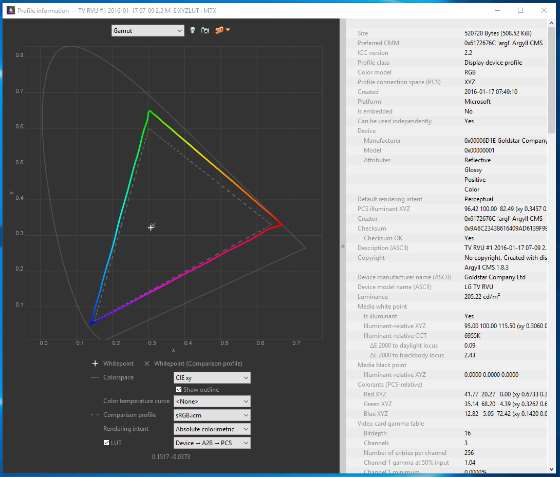
One of the goals of calibration is to achieve a particular white point. This is important for any photo editing, or else once you get things looking right on your screen, the white balance will look off everywhere else. Calibrating to a 6500K white point will usually make sense. The DisplayCAL software was particularly helpful for getting this close using controls on the actual display, so that the connection between your computer and display can still use the full available range. Otherwise, creating a profile is surprisingly automatic, and at the end of the day, I had an accurate (hopefully!) .icc profile for my LG EG9600, and a better understanding of it’s coverage relative to sRGB:
Cameras and File Formats
What’s next after calibrating a wide-gamut display? Do you need a wide gamut camera to go capture this wider range of colors that your monitor can now display? Fortunately, the answer is no – unless you want a camera that can capture infrared images! Cameras don’t have the tough task of creating light at specific wavelengths; they only need to filter light, and that’s a much easier task. Even the digital cameras of 10 years were capable of capturing color well beyond what current displays are capable of reproducing.
However, this isn’t necessarily the case with file formats that the camera stores. If you shoot JPEGs, then your camera has to convert the very wide range of color that its sensor is capable of to one of the narrower color spaces that is appropriate for a JPEG. The most common of these is – you guessed it! – sRGB. Any colors in the original image outside what sRGB can represent get mapped to the closest matching color (which may not really be very close at all). Most DSLRs offer the option of recording in a wider color space, like AdobeRGB, but this has many issues of its own, as laid out in this fstoppers article on AdobeRGB vs. sRGB. One issue it doesn’t mention is that trying to represent more colors when you’ve only got 8-bits per channel to do so makes AdobeRGB more likely to result in banding (e.g. in the gradient of a blue sky). The biggest headache, though, is that you’ll likely need to convert the image to sRGB anyways before publishing or sharing it.
And if you’re going to do that, you might as well use RAW for this purpose. I’ve always thought RAW was the right choice, especially for non-photographers who make mistakes that RAW can help recover from. For color, RAW is vastly superior; it captures everything the sensor is capable of detecting, and doesn’t throw information out to produce a JPEG in a narrower sRGB space. Even if you don’t use this now, in 5 or 10 years from now you may see colors you never knew were being captured all along. Today, you’ll still export from RAW into sRGB JPEGs, but if you keep the original RAW images around, then when a wider gamut standard like Rec.2020 finally becomes commonplace even for images, you’ll be one automated re-export away from benefiting.
Color Managed Applications (and Services)
Does everything suddenly get more accurate as soon as you install that shiny new .icc profile? Sadly, not. Only applications that are color-aware will even pay attention to the fact a profile is installed at all. The significant majority of applications ignore it, and continue to crank out sRGB images that will look oversaturated when displayed using the full gamut that a wide gamut display offers. Things are apparently much better on Mac in this regard, but on Windows, just three applications I use have any form of color management:
- Adobe Lightroom. Since this is where I do all my photo editing, it’s really the only application that matters to me. I really do rest easier knowing that I’m not spending hours and hours editing photos solely to make them look better on my monitor. I know given the current state of the world that almost any photo I share will be viewed on an uncalibrated monitor, but since many of the photos I take now are for looking back later, I’m optimistic that this will make a difference on the highly color accurate display technology of the future :).
- Adobe Photoshop. I don’t use this, but it is certainly color aware!
- Web Browsers (partially). Outside of photos and games, virtually 100% of my time is spent in the browser, so in a way this is the only application that matters. Today, Chrome color manages JPEG images that have a color profile attached (but doesn’t manage untagged images, which is most of them). We’re hard at work making this better, so I’m optimistic that soon everything will be accurate! Firefox similar has partial color management. Safari is fully color managed. Surprisingly, both IE and Edge seem to entire ignore output display profile!
A feature of Lightroom I’d never used before is soft-proofing; it’s a feature designed to let you preview what output will look like. When in soft proofing mode, you can specify a target color space, and enable an out-of-gamut warning; this will show any parts of the image with colors that can’t be accurately represented using bright red (or some other color of your choosing). For example, consider this simple shot of Teh O Limau Ais (iced lemon tea at a Malaysia food stall):

The image you’re seeing was already converted to sRGB, as nothing else really works today. But how much of this image was out of gamut? As it turns out, quite a lot:

So, why not exporting JPEGs in a wider color space that preserves captured color at least to the extent that I see it when processing photos on my display? For starters, an 8-bit JPEG is going to produce more banding when used with a wide color gamut; a 10-bit+ image format is really needed to make this practical. But even if that wasn’t an issue, essentially every service – including SmugMug, which I use for hosting photos you see here – converts anything you upload to sRGB. In part, this is because the vast majority of web users have displays that are sRGB at best, and more typically 72% of sRGB. It’s also because web browsers historically didn’t properly handle images in non-sRGB color spaces and would display them washed out. While that’s largely no longer true – Edge, Chrome, Firefox, and Safari all handled ICC-tagged JPEGs – people do sometimes stay on old browser versions for a while.
Summary
So that was long and complex, but I think I’d summarize as follows:
- If you don’t edit photos or do color work, when you’re getting your next monitor, get something that’s 100% sRGB (or use your monitor in sRGB mode), but not wider. Unless you like unrealistically saturated colors, which you may!
- If you edit photos or really want accurate colors, consider a wide gamut display. But be prepared to invest in calibration, figure out which of your apps are color aware, make sure you’re shooting RAW, and have patience until file formats and the web catch up with you. If you’re shooting memories for the long term, it will pay off at least a little!
-
More Things I Use
Besides the Sigma 50mm f/1.4 Art I mentioned a few posts ago, and monitor/home theater changes I’ll mention separately in the future, there’s a number of other things I started using over the past year or so. Here’s a few notes on those things!
HIFIMAN HE400S

This purchase was one born entirely from curiosity, as there’s truly nothing wrong with the Sennheiser HD-595 open headphones that I’ve historically used. Indeed, this was a particularly wasteful purchase because I only occasionally use headphones now that my computer is tucked away in the basement, inaudibly far from where anyone might be sleeping. The big draw for me with these particular headphones is that they’re electrostatic, like the Magnepan IIIs I’ve used for a couple of decades now and have been a fan of for music listening. Past electrostatic headphones were uber-expensive ($1000+), so when these came in at the “low” price of $299, I indulged and picked up a pair. I don’t try enough headphones to accurately review how these fare against anything else on the market, but I do prefer them over my 8-year old HD-595s and to my ears, they sound great and are the best I’ve heard in this category. I don’t know I could call a winner between these and my ER-4PT earbuds; the earbuds benefit from blocking out all background noise, but the open circumaural design on the HE-400S is much more comfortable to me for extended listening.
SVS SB12-NSD

I’ve used a full sized subwoofer in my computer audio setup for about 16 years, largely because of a “deal” back in 2000 that wound up with me owning multiple Advent AV-550S subwoofers at a low price. A few years ago, I replaced the one in our home theater setup with an SVS PB12-NSD. While it was a little smaller than the 15″ AV-550S, it was significantly clearer and represented a significant step up in overall quality. This always tempted me to also update my PC setup, but it seemed a little wasteful to get a nicer subwoofer just for a PC setup. However, in late 2015, the SB12-NSD (a sealed version of the PB12-NSD) went on final closeout, having been replaced some time ago by newer models. I was so happy with the PB12-NSD upgrade that I couldn’t pass the chance up!
First off, I was pretty wrong in thinking this wouldn’t make a big difference in my PC setup. In retrospect this is obvious, but because I use smaller bookshelf speakers in my PC setup compared to the HT setup, the sub is actually much more important since it’s actually handling a greater portion of the overall audio spectrum. In any case, the upgrade was very worthwhile; unexpectedly, I actually have a greater tendency to listen to music while working at my desk than before, and it’s a much closer experience to the bigger speakers elsewhere in my home.
I also learned something I wish I’d known earlier about setting phase on a subwoofer, which historically I’d always done via trial & error with no confidence I was making any real difference. A forum post somewhere recommended simply playing an 80Hz test tone (or whatever crossover frequency you wish), using an SPL meter (or your ears) in your main listening position, and tuning phase to maximize amplitude. Subjectively, it feels like that approach worked really well, even with the $17 SPL meter I use.
Canon Pixma Pro-100

I’ve been on the fence about getting a photo printer. It’s generally not necessary, because Costco and others will happily use a high quality printer on whatever you care to send them, and they’re just a few minutes from my home. Two things finally got me to pull the trigger on this. The first was a rebate from Canon that effectively reduced the price of this printer to $200 (half it’s normal price). The second was looking into color gamut, and realizing that the color gamut (range of colors that can be represented) is higher for my camera, this printer, and monitor than it is for the (sRGB) JPEGs that any consumer photo service is willing to accept. In other words, exporting my photos to JPEG and sending them to Costco meant a loss of certain colors that their printers (and now mine) would actually be fully capable of reproducing.
Is this difference visible? I honestly haven’t done enough testing to know yet, but for 50% off, I was willing to experiment. It’s half worth it just to install all the ink cartridges, each of which gets has its own impressive glowing LED once properly installed:

P.S. the LEDs in that picture are a good example of a color that’s out of gamut, which is partially way the image above doesn’t look as nice as the real thing :).
Tamrac JETTY 7

I already have a fairly crazy number of camera bags, each of which seems to serve a different purpose. The Think Tank Digital Holster 40 is great when I’m bringing just one lens; the Lowepro Rezo 180AW worked well with a few smaller lenses (not the f/2.8 zooms) plus a flash but was a bit bulkier to carry around; the Tamrac Rally 7 is still the travel bag I use all the time when I need to bring a 15″ laptop, my D800, and several large lenses. Amazingly, this still left me wanting a bag that was as unintrusive as the Think Tank, but sufficient to carry a pair of smaller lenses. The Tamrac JETTY 7 turned out to fit this bill quite well – it decently holds the D800, a couple of full frame primes (one attached to the body), a small flash (in the front compartment) – and even a tablet, though I never bring one:

I tried this bag mainly because it was on sale at Costco, but I now use it regularly – though amazingly, I do so alongside all three of the other bags mentioned, which still see active use!
Motorola Nexus 6

Valerie completely the destruction of her Nexus 4 about a year ago, so I needed to either get her a new phone, or give her my Nexus 5 and switch to something else. I decided to try the Moto Nexus 6 to see how I felt about the oversized phone thing. I find it… a little oversized. The increased screen real estate is nice, but no amount of getting used to the phone will increase the size of my hand. In any case, there’s plenty of material out there on this and every other phone, and 12 months later it’s old news, so enough said on this!
-
Lighting!
Four and a half years ago I wrote a post, Umbrellas are for rain!, and shared a few photos that Wen and I took outside using regular Nikon flashes with a shoot-through umbrella to diffuse the light. It did certainly cross the line of not taking photography too seriously, but only by a little; after all, it’s just an umbrella!
My use of flash has decreased since then, from 33.5% at the time (with the D7000) to just 21% in 2015 (with the D800), in part because the full frame D800 can produce decent results even in fairly low light (even though it doesn’t hold a candle to something like the much newer D5). At the same time, the lighting equipment I have available jumped into the truly ridiculous category (given that I still don’t think of myself as a photographer). This was all thanks to gifts from my mom and Sugawara San, not due to my own going crazy!
elinchrom D-Lite 2

The elinchrom D-Lite 2 is an AC-powered studio flash unit. It’s 100% manual; you’ve got to set exactly the power level you want, connect it to your camera with a cable, and it will fire every time you press the shutter button on your camera. It works just as well with old film cameras as it does with modern DSLRs, but if you’re used to your flash automatically figuring out what the right power level is, then a unit like this will take some getting used to!
A pair of these came in a kit together with a softbox and a stands. The softbox reflects and diffuses the light from the flash head itself, and creates a much bigger effective light source if you’re close to the object you’re taking a picture of. Once assembled, the setup looks like this:

I now use these almost anytime I’m taking a picture of the types of things I post here – since I almost do those things at night when there’s no light available. The manual operation seems a little daunting at first, but once you’ve used them once or twice it’s actually pretty easy since you’ll use the same settings basically every time. These are often used for portraits and the like, but since everyone here is asleep I took a picture of a really old dusty toy instead:

Zoids! I doubt anyone remembers those, but it was great to build them up out of smaller parts back in the 80s:

At first glance, it must seem ridiculous and expensive to get studio equipment – but it is surprisingly affordable. For instance, if you just want to experiment, B&H sells a brand new, reasonably reviewed kit for $127, which includes the flash unit, softbox, and stand, and cable. That kit has a 100W/s flash, as compared to the 200W/s D-Lite 2 – but I almost never use the D-Lite 2 above half power – and 100W/s is a good bit more than almost any camera-mounted flash. It’s also much cheaper than a TTL flash of similar power from your camera vendor, despite having a stand and softbox. It’s not for everyone, but if you take lots of indoor pictures I’d definitely recommend giving it a try!
Bowens esprit 2
If the shopping trip to Glazers that picked up the elinchrom kit had ended with the above, that would already have been well beyond my needs. But, there was an apparently “great deal” on something that goes so far beyond what I need (especially given the low noise levels on current digital cameras) that I have basically never used it. That deal was on a Bowens espirit 2, which is a 1000W/s light cannon that allows you to engage the sun in direct combat:

I’m not kidding about the sun thing; 1/10th that power is already enough to take pictures at ISO 100 f/8, but if you want to get rid of those pesky shadows for a subject that’s actually standing out in the sun, then this thing is your ticket. It’s also theoretically useful if you’re taking group photos, and need to cover a wider area in light. Just don’t point this thing directly at people or you’ll blind them! You really have to use a reflecting or shoot-through umbrella.
Firing this thing at full power really makes you feel like you’re already part of a Type II civilization. Or a Star Wars villain, cranking the power to 100%, waiting for the green light to indicate that it is fully charged, and then pulling the trigger to blow away some unsuspecting victim.

Yongnuo RF-603N
Manual flash cables are kind of a pain, so it was great to discover the Yongnuo RF-603 radio transmitters! Whereas fancy RF units that support Nikon or Canon (or other’s) TTL systems (where the camera and flash figure out the right exposure for you) cost around $200, a pair of these go for just $27!

These small battery powered devices are actually really versatile and useful, and I highly recommend them. You can do any of the following with two or more units:
- Connect one unit into your camera’s remote release (using a cable like the one shown on the right), and use the other to remotely trigger your camera. This seriously beats setting a timer and running back into a group shot, and it’s way cheaper than what your own camera maker will try and sell you, plus it is radio frequency so you don’t need to point at the camera and look foolish in your own picture.
- Put a unit in your camera hotshoe, and trigger any hotshoe-based flash (like the one you may already own) remotely. If your camera/flash don’t have built in features for remote operation, this is a really cheap way to get this capability – though it does require that you can set power on your flash manually (or that it defaults to max power). This also lets your synchronize multiple flashes.
- Same as the above, but attaching a PC sync cable to fire flash units like the two I mentioned above.
The nice thing about the RF-603 is that the shutter release vs. flash release are independent signals, so you can do two of the above concurrently! This allows a single unit to be used in your camera both to trigger the shutter and to remotely fire a flash.
Power Comparison
Just for fun, I took a few comparison shots that illustrate the power levels of different flash options. All of these are at (or adjusted to) ISO 100, f/5.6. I used the following:
- D800 built-in flash
- Nikon SB-400, the first flash I ever purchased. The main benefit it adds is the ability to bounce off the ceiling.
- Nikon SB-800, a larger unit that uses 4 AA batteries and has been my primary flash for many years.
- elinchrom D-Lite 2
- Bowens esprit 2
First up, the D800 built-in flash. Unsurprisingly, at ISO 100, it lacks the power to light things up even at f/5.6:

Next, the Nikon SB-400, which actually had slightly less output (but perhaps a little more dispersion):

Finally, the SB-800 started to deliver enough power to brighten things up a bit. I think it’s equivalent to about a 90W/s, so you’d expect this. Of course, when operating the SB-800 at full power, you have to wait a long time for it to recharge:

The elinchrom D-Lite 2 has similar apparent brightness, but only because it had much wider dispersion; you’ll notice that more of the background is visible than with the SB-800. It’s roughly twice the power of the SB-800, but also recharges quicker at full power due to having AC power:

Finally, the Bowens really lights things up – you can see much further into the forest behind the garden area. The photo understates how blindingly bright this was, especially at night. It also shows how anything even remotely near the Bowens will be over-exposed, even at ISO 100, unless you stop down to at least f/8 or so:

Take that, sun!
-
Sigma 50mm f/1.4 Art
Somehow, I managed not to post a single thing in the entirety of last year! Switching roles at work, a permanent backlog of photos to be processed that took me till this year to get through, the manual labor to refresh our home theater room – there just never seemed to be the time. Not that this year is likely to be any different!
One thing I’d put off from 2014 was mentioning a lens I picked up that year, the Sigma 50mm f/1.4 DG HSM Art:

A 50mm standard prime is normally considered pretty “boring”; it generally can’t do close ups with nice background blurring, nor can it capture panoramic landscapes. Nonetheless, it’s one of the most common primes on a full frame sensor (with 35mm being equivalent on a 1.5x crop camera). In fact, my own tendency to use primes started with the Nikon 50mm f/1.4 AF-D back in 2009; after seeing the improvement in image quality over my 18-200mm superzoom, I started leaning much more heavily towards primes.
Despite the Nikon 50mm kicking off this trend, I didn’t ultimately use it that much. The fabulous, inexpensive Nikon 35mm f/1.8G was a better match for the crop cameras I used until 2012, and by the time I went full frame, I’d picked up the Nikon 24-70mm f/2.8G AF-S; it didn’t have as wide an aperture as the Nikon 50mm, but it had superior optical quality and focus speed/accuracy despite being a zoom lens.
So it was a bit of a gamble when Sigma introduced the 50mm “Art” lens pictured above. It had a number of fabulous early reviews, and amazing sample shots even when used at f/1.4 or f/2.0, but it was unclear whether I’d wind up preferring it over the 24-70mm that was seeing the most usage at that time. To keep things short: it did, and I kept more shots with this lens – 30% of what I took in 2015 – than with any other.

The image above is from a visit to the Batu Caves in Malaysia; there’s lots of monkeys roaming around, in some cases looking for things they can snatch from unaware passers by! There was an extremely strong backlight – the monkey isn’t against a totally white background because I lured it into a studio or as a result of heavy editing. Normally this would cause flare galore, and a strong lost of contrast – especially when shooting at f/2.8 as in the above photo. But despite the worst of conditions, the Sigma managed an image that I really like.

The above is also from Batu Caves, and shows the incredibly strength of a bunch of red ants that were carrying this dead cockroach back towards their nest. Amazingly, the ants you see pictured here were able to lift that massively bigger carcass up a vertical stretch, at least until gravity won out and destroyed their progress; it was pretty amazing teamwork nonetheless. In any case, the Sigma 50mm is no macro lens but it’s sharpness even at wide apertures – this one is also f/2.8 – coupled with the high resolution of the D800 makes it possible to capture some pretty small things without dragging a dedicated macro lens around.

Even at f/1.4, as in the above shot, the detail in the very narrow band that’s actually in focus at that aperture is just incredible. The Nikon 50mm would lose contrast and sharpness across the entire frame if you had to use it wide open; that wasn’t the case here, and the bokeh feels very nice to me especially for a standard prime.
Every lens has drawbacks, and for the Sigma, that’d be weight and price; its very solid construction yields an 815g lens that is very close to the weight of the 24-70mm zoom, and at $950 it’s significantly cheaper than Nikon’s high-end 58mm f/1.4, but significantly more expensive than the $350 it cost for my older Nikon 50mm f/1.4 (or Sigma’s own non-Art version of the same). Still I’m completely without regrets in having picked up this lens!

-
Toys on Christmas Morning
I guess when you do Christmas morning with six adults and just two kids, the grown-up toys seem to outnumber those for the kids. This is especially true when four of the six decide that Christmas morning is a good time to take some photos – and bust out the toys to do this with:

Counterclockwise, from the right – the Nikon D7100, Nikon D7000, my Nikon D800, a Pentax 645 medium-format film camera, Leica R4 35mm film camera, and in the pouch, a Fuji Finepix f31d. At least in the unlikely event that our kids ever become famous, they’ll be used to the paparazzi!
Not shown is the couple of strobes used to light the living room.
-
Things I Use: Nikon 24mm f/1.4G
It wasn’t that long ago – 21 months, to be exact – that I joked that Nikon’s updated prime lenses seemed to be for people who were made of money. But as I mentioned when starting to blog at all, one of the great things about it is having to look back and eat my words or laugh at my own foolishness. I just thought it’d take closer to a decade for that to happen, but it looks like I’ve already reached that point.
If you’ve followed what I’ve posted here the last couple of years, you’ll already have noted that I’ve some hypocritically moved from having amateur skills and decent but amateur equipment, to having amateur skills and professional level gear. What led to this? No, I didn’t glance down and realize that I was actually made of money and that I could thus lose weight by spending it (though that would be nice). In large part, it was the realization (such as with selling my 10-24 ultra-wide lens) that lenses really are a capital investment, and that even buying new you don’t lose that money. A related factor was buying everything used in the first place off of craigslist. Finally, living in the U.S. has the double benefit of lower taxes and a much wider range of highly competitive online merchants.
So, in July of last year, when a 24/1.4 showed up on craigslist (a relatively rare occurrence) at a good price, I did what I thought I’d never do and bought one:

Did I really need this lens? Definitely not – it’s overkill for a non-photographer, especially since I already had the fantastic 24-70 f/2.8 zoom lens that has awesome image quality and is just a couple of stops slower. That said, the 24/1.4 has quickly become one of my most used lenses, in large part because going to f/1.4 or even to f/2.0 really crosses that threshold of being able to take low light shots with no flash at reasonable shutter speeds – especially in combination with a full frame camera. Indeed, 36% of the shots I’ve kept from this lens have been at f/2.0 or wider; that increases to 42% if I exclude one batch of 100 photos at my cousin’s wedding tea ceremony (which were all taken at f/5.6 with a flash).
Here’s one example, of my friend Ahmad holding his young daughter:

Even at a relatively slow 1/80th of a second, the above was already at ISO 800 even at f/1.4. Even a big f/2.8 zoom would have pushed things up to ISO 3200; a kit lens would have cost another stop beyond that. Of course, conditions get much more extreme than that – for example, the following from my cousin Mike & Jackie’s wedding this past summer:

While I did play with the color, the shot itself was outside, hand-held, close to midnight, at a 1/40th shutter speed and ISO 6400 (the highest native ISO that the D800 supports). With a slower lens, I’d simply have needed a tripod – and I never take one with me, so I wouldn’t even try and take things like the above. Finally, here’s one of Olivia, with identical settings to the above:

Twice a week (on “no dessert” days), at bedtime, Olivia’s allowed to read a book herself on the tablet instead of reading a paper book with me – and when I say “read”, what I’m actually talking about the “Read To Me” mode of Dr. Seuss books on Android that read the story while highlighting the words. The only source of light above is what’s coming from my Nexus 7 – which is already on the lowest possible brightness settings since there’s zero ambient light. It’s no lie to say that the camera sees much better in the dark than I do.
So far, I just talked about how amazing it is to have an f/1.4 lens to shoot with; you could do much of the above with a vastly cheaper 50/1.4, unless you really did need to be wide (which sometimes you do). The 28/1.8 which is also 1/3rd the price is pretty darn close too (and I almost went with that option). But between truly getting wide, having an amazing close-focus distance, great AF in general, and really nice (for a wide prime) bokeh, I’ve been really happy with the the lens. As a final example, here was a quick test shot in the garden soon after I got the lens:

While that’s not the best bokeh example by any stretch, for a 24mm focal length I thought it was pretty decent. But even more impressive, and the main reason for using this photo as an example, is how darned close I actually was to the bee – remember that this is equivalent to a 16mm lens on a crop camera! A crop from the above might provide a better idea:

It feels totally absurd to live at a time when you can stick a very wide angle lens on a camera, shove it right in the face of a bee, depend on auto-focus to get everything right – and get something with the detail of the above, but hey, I’m not complaining!
Ultimately, you have to be pretty crazy to get a lens like this for casual snapshots in the middle of the night with only a tablet as a light source, but I’ve used it more than anything else I own since buying it. And it helps when I tell myself that I can probably sell it for pretty much what I paid for it – even after I get a few thousand shots with it!
-
Some new(ish) things I use
I have completely neglected posting anything for 3 months – and it’s now hours away from 2013! Perhaps it just didn’t seem worthwhile with the supposed end of the world upon us, but with that excuse out of the way, I guess I should stop procrastinating. In fact, there’s a whole set of things I’d meant to share that have collected in open tabs and the like, but I’ve been really busy and never got to any of it. I’ll try and start working through the queue with an update to the list of Things I Use – this time, for audio. I didn’t take the pictures for any of these, images are from the product makers!
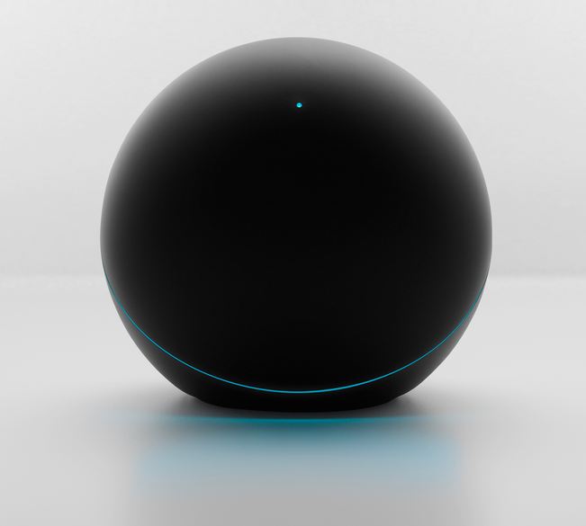
Google Nexus Q
I was fortunate enough to get to try the Nexus Q shortly before it was introduced at Google I/O (and to keep it afterwards). While there was much debate of the Q vs. other video streaming boxes, I have to say that as an audio-only device it does quite well at filing a fairly particular niche.
For many years, I struggled to find an effective way to stream music to stereo speakers at high quality within my home, so that I wouldn’t have to actually find a physical CD to hear something. I wasn’t so concerned with online music streaming, because Canada had no viable services that you could actually sign up for (and when I started this pursuit, back around 2002, none existed anywhere). Storage, even with lossless compression, was a non-issue even a decade ago. I just wanted a CD player replacement.
My first attempt involved building something myself. Using a mini-ITX PC, a PCI Soundblaster card with a digital audio out (to a DAC), a fanless case and power supply, and a stripped down Linux configured to boot from LAN, I was able to get something up and running. It took a ton of effort – I had to tweak and compile drivers for the Soundblaster due to the lack of standard glibc in that micro-Linux distribution! It’s funny looking back, because I’m far too lazy today to do something like this. Unfortunately, sound quality was terrible, even with a high quality external D/A converter, because the Soundblaster resampled everything to a fixed 48kHz output rate. All my 44.1kHz sampled music (from CD) was being put through this process, and didn’t sound like the original CD. This was improved by forcing the music player to do its own 48kHz resampling with a better algorithm, but still, with no remote control, the system really wasn’t too usable, and I barely made use of it.
Next, I was probably one of the only owners of the optional Playstation 2 Ethernet accessory, which I think cost somewhere around $100, and which I used exclusively for media streaming. The PS2 had good connectivity into my A/V system at the time, so this had promise. I used the QCast Tuner software for media streaming, and it worked OK but was intermittent in terms of reliability. And I still needed to go stick the QCast Tuner disk into my PS2 and boot it up to play anything, which was actually slower than finding a CD, so I never really used this much either.
Finally, in 2005, along came the Squeezebox 3. At $299 without Wi-Fi for something that played music only, it was a little pricey, even at the time – but it was a great device that I use actively even today. It has great usability, a nice onboard DAC, plays music in almost any format, and even does true lossless audio – a DTS-encoded 5.1 audio stream encoded into the 1.5Mbit/s audio format used on CD plays back flawlessly, in surround sound. It’s analog audio outputs can be configured, if desired, to be volume controlled in order to directly drive a power amp. It was what I’d tried twice to come up with, but in a form factor that actually worked.
The Nexus Q delivers something similar, and improves in some areas by integrating an amp that can drive speakers directly. I was pretty skeptical about the power and quality of an amp that would fit inside the sphere, but was impressed when I actually tested things. It drove my Axiom M2 v2’s higher than I’d practically need before there was notable distortion (though you could definitely tell when you hit that point), and worked even better when paired with an old pair of Infinity Compositions Overture 2’s; those speakers have built-in powered subwoofers and seem to be the perfect companion for the Q. A bonus to getting rid of the external amp is that you can just play things at any time without powering the amp on or off (the Squeezebox didn’t have 12v triggers for this). Controlling playback entirely via an Android phone was something I was already doing with my Squeezeboxes, and it’s far better than traditional remotes.
Some bemoaned the lack of integration with other services like Spotify and Pandora, but as my goal was listening to music I own which was easily uploaded to Google Play, this wasn’t an issue for me. The lack of pre-amp outs mean I can’t connect the Q into bigger speakers, like my old Magnepan MG-IIIs, and when paired my with Axioms, there was no easy way to connect my subwoofer. Still, for certain room & speaker configurations, the Q as shown at I/O was a good alternative to something pricier like a Sonos.
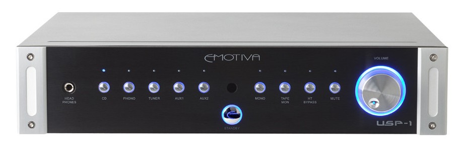
Emotiva USP-1
For quite some time, I’d just directly connected my Squeezebox into my power amp. There are a couple of drawbacks to this setup. The most obvious is that if you want to use anything else as a source of audio – like a CD/DVD/Blu-Ray player- you can’t. The second, which I only learned of a little later, is that volume is applied via digital attenuation. But even with a perfect DAC, if you’re using this approach with a 16-bit input signal (which is what CDs are encoded at) and have a 24-bit DAC, you can only chop off 8 bits before you’re killing off useful bits to lower volume. 8 bits is roughly -24dB of attenuation, and I’m often below that volume level.
The main reason I’d started connecting things directly is because I’d lost two previous pre-amps; a re-purposed Sony TA-E9000ES that died, and a true analog pre-amp (with no remote) that had become persistently flaky in one channel. So when Emotiva did their summer sale this year, I picked up the USP-1. I quite liked the UPA-2 2-channel amp I purchased a year earlier, and Emotiva’s overall philosophy of good build quality, reasonable prices, low marketing/distribution costs appeal to me.
Without having done meaningful tests of the USP-1 versus other preamps in an identical configuration, I can’t say much about its performance, other than to note that it sounds perfectly adequate and at least as good as the direction connection approach without either of the drawbacks I mentioned above.
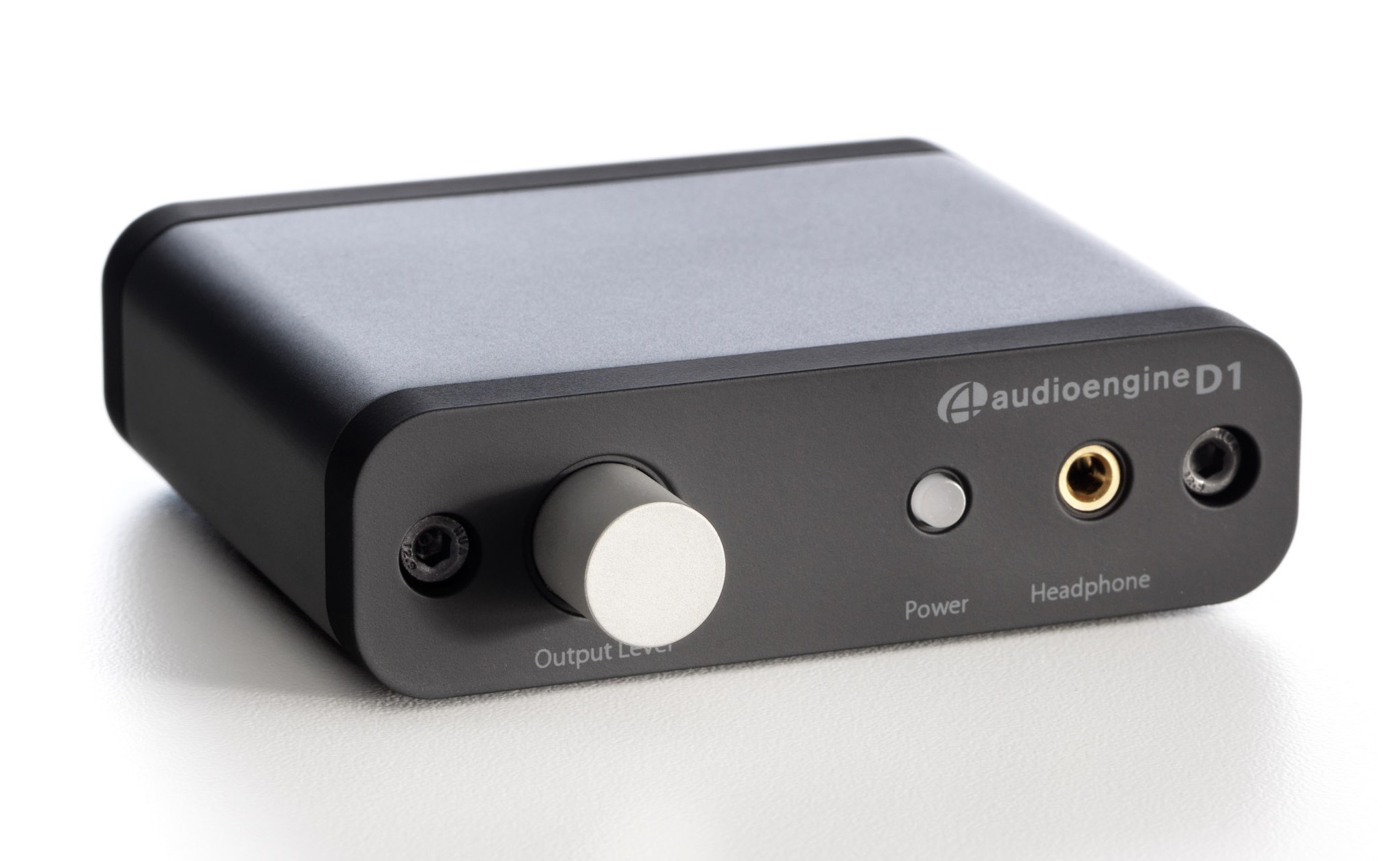
Audioengine D1
For many years, I tolerated the built-in audio support for my PC. I’m not sure why, as it’s often been the case that internal audio solutions have picked up audible hiss or interference. The Realtek solution in my Dell was no exception to this; it has all kinds of high frequency buzzing on its outputs that I don’t understand why I waited so long to get rid of. In any case, the thing that finally pushed me over the edge was getting a Das Keyboard mechnical keyboard a year ago; this meant I no longer had volume control buttons on the keyboard, which was pretty inconvenient while playing something like Starcraft. The Audioengine D1 was pretty pricey solution to this problem at $169, but I really wasn’t satisfied with the audio from my PC, and reviews on the D1 were great, so I decided to go ahead. I’m sure there were more economical solutions to the problem, and I don’t think the D1 really added $169 of value for me, but it did solve the problems I was dealing with. And had I waited, I would probably have gone with an even greater level of overkill.
Speaker Stands
Truth be told, I was hoping for a little more improvement in audio quality with the D1. However, playing around a little, it was clear that speaker placement was the biggest issue. If I lowered my ears to desk level, things sounded much better. And indeed, recommended desktop speaker placement all recommended elevation so that speakers were at least on-axis with your ears, perhaps tilted upwards a little to avoid reflections off the desk. Sadly, the number of people who care about this is small enough that there were virtually no reasonable 4″ – 6″ desktop speaker stands; people either made their own or used stacks of CDs and the like. I opted to use a few spare rolls of painters tape as a temporary solution to at least get some clearance off the desk, and it definitely helped!
-
A few interesting photos
I meant to share a couple of photos that I found interesting. The first is of some waterdrops caught in the various spiderwebs we have around our house. Close up, they look somewhat surreal – it’s a real testament to the relative strength of the web that what look like huge globes of water are suspended by near-invisible threads:

The above was near the ground; our shrubs had one that looked more like the spray of a shower:

Like virtually all photos I post, you can click the above to enlarge to see more detail, if you’re interested.
The second picture is more one of those “I wish I brought my camera” moments. In my last post, I mentioned my 8-day effort to undo a bunch of recent weight gain. That involved a lot of walking, since walking doesn’t tend to leave you in a disabled state like an excess amount of other types of exercise can. Kirkland has many nice trails that make walking enjoyable if you have the time, and on one fine summer day, there was a great sunset – and an interesting glass sculpture to go along with it. Sadly, the only device I was carrying was my Galaxy Nexus – a great phone, but no better than average as a smartphone camera. The image I got kind of works at reduced web sizes – but totally fails to capture how nice the actual scene was when you try and view it much bigger.

The next day, I walked the same route but with the D800 this time. Regrettably, while it wasn’t overcast or anything, conditions completely paled in comparison to the day before. I might not even have stopped to take a shot if not for comparative purposes! Still, the ridiculous dynamic range of modern cameras helped capture much detail that was lost in the above shot:

A different angle:

It’s a shame the conditions the second day weren’t anywhere close the first day, but I guess you can never tell how things will turn out.
-
Ubiquitous Internet = better fireworks

I posted some 4th of July fireworks pictures on Google+, noting that I was pretty impressed that a relatively small town like Kirkland managed to put on a nice display out over the water. While you could see the bigger show going on in Seattle at a distance, what we got locally was pretty cool.
It’s been two and a half weeks since then, but I thought I’d follow up and share the rest of the pictures I took (via the slideshow/gallery link below), and mention how helpful ubiquitous Internet access was in learning the basics of how to even go about taking these shots. I don’t shoot much landscapes or scenery – our kids are my primary subject – and I don’t think I’ve ever left the house with a tripod before. But since the family, minus myself, went off to Toronto on the morning of July 4th, I had the opportunity to give it a try – plus Olivia had already started to say that she’d like to see the fireworks, even though she knew she was leaving that morning. Some of the basics – using longer exposures, keeping ISO relatively low – were sort of intuitively obvious. But at least one simple thing – using bulb mode to manually control the start and end of each exposure – helped greatly, but just isn’t something I would have thought of, since bulb mode just isn’t something I’ve really ever used. Another thing that clear in retrospect but that I didn’t figure out on my own is that like flash, the brightness of the fireworks themselves aren’t really affected by exposure time, so picking the right aperture (usually f/8 to f/11) is actually more important. One thing that’s kind of neat – shooting at base ISO and f/8 means a basic camera and kit lens would be perfectly sufficient!
So, thank you Galaxy Nexus + Chrome for Android + Google Search + experienced photographers who share freely + a lengthy wait for the fireworks to actually start – this first real attempt at this subject matter turned out much better than it would have otherwise (I say “real attempt” because I snapped some handheld shots on Canada Day a couple of years ago while holding a crying Olivia with the other hand).
(Slideshow which links to gallery below – won’t show up in RSS)
-
The bag I’ve been looking for
I’ve been really bad with posting consistency recently; I finally got to a backlog of things I had meant to mention a month ago, and haven’t posted anything since. Though like last time, that’s meant there’s a queue of things I’ve been meaning to share, after which I should really try and be more consistent!
The first thing I wanted to mention is a new camera/laptop bag I picked up. I already had quite an assortment of bags:
- Think Tank Digital Holster 40 – great for walking around with the D90/D7000 or D700/D800 with a single lens attached. I use this the most, but when traveling with more than one lens it’s not ideal.
- Lowepro Rezo 180AW – small/medium shoulder back that was great with the D90/D7000 and most DX lenses, but too small for the full frame stuff I use now.
- Lowepro Classified 250AW – huge shoulder bag that also takes a laptop. Great for transporting a bunch of equipment (camera + laptop) from A to B, but is too big to lug around during the day.
- Lowepro Flipside 300 – medium backpack that holds lots of photo stuff, but doesn’t provide quick access to your camera.
I’d tried quite a few different approaches to travel, but nothing really worked well. The Classified 250AW held everything I needed, but it was just too big; most airlines limit you to one carry-on bag (up to 9″ deep) and one personal item – a laptop bag, purse, briefcase, camera bag, or other such item (up to 6″ deep). The 250AW was well over the personal item depth – in fact, it was pretty much 9″ deep if you brought much stuff! Other configurations, like just bringing the holster and sticking my laptop/lenses in a regular rollaboard worked but weren’t great. Before a combined work/personal trip to New York back in May, I went looking for a solution to this issue, and decided to try out the Tamrac Rally 7 bag (aka Tamrac 3447). It’s been great!

It’s form factor is about as minimal as you can get when carrying a laptop + camera + lenses, and while it’s technically a tad over the 6″ limit, it looks and feels like a personal item and stows easily under airplane seats. Despite this, it holds a good amount of actual equipment; I just got back from Toronto, and packed it with the following:
- 15″ Macbook Pro (which fits easily but snugly)
- Nikon D800 with a 24/1.4 lens attached (the 24-70 2.8 would also fit)
- Nikon 70-200/2.8 lens (though this wouldn’t fit if attached to the camera)
- Nikon 50/1.4 lens
- Nikon SB-800 flash
- Chargers for both the camera and laptop, mouse, keys, wallet, etc.
The shot above is with all of the above in the bag; it’s a great fit for a configuration like that. With the top flap open, it looks like this:

It’s easy to pull out the camera whenever you need it, and having done several outings with the bag now, I’m pretty happy with the purchase – especially since it was just $90 on amazon.com, which is well below what I spent on the 250AW. The bag isn’t perfect, though; the following are things I wish were done better:
- The strap is non-replaceable and the plastic ring you see on the left constantly causes the strap itself to bunch up; there’s no freely rotating rings that allow you to straighten the strap out while on your shoulder.
- There’s a thin pouch (e.g. for a magazine) on the rear, but you can’t put a rollaboard handle through that area to walk securely with this bag atop a rollaboard.
- The top handle you see in the first picture is really dinky and isn’t suitable for lifting the bag if there’s anything in it.
Despite this, the bag works really well and I’m happy with the purchase!


