Learning About Color
Over the past half year or so, understanding color and how it’s handled digitally became much more important to me. I even understand how to spell it the American way now! Some of this was related to my work, where handling video content in different color spaces is becoming increasingly important, especially with the emergence of new standards around UHD Premium and HDR. However, for personal use – choosing a monitor, editing photos, sharing them – an improved understanding has helped significantly as there’s an unfortunate and unsettling set of tradeoffs in digital color handling. I’m still no expert, but here’s what I’ve learned that’s relevant in personal use.
Color Fundamentals
We learned back in elementary school that your eyes have rods and cones, that the cones allow us to see color, and that we can roughly see light with wavelengths between about 400nm (violet) and 700nm (red). We’ve got three types of cones – typically called Short, Middle, and Long based on the wavelengths they are most sensitive to. And while color in reality is pretty complex – an object will emit or reflect light at every wavelength we can see, just at a different level for each wavelength – all that matters to our brain is how much each cone in our eye responds to a given color, an effect called metamerism. Effectively, our cones turn a complex blend of light at different wavelengths into a set of three “tristimulus” values – in much the way that our tongue turns fancy food into measurements of how sweet, sour, salty, bitter, and umami something is.
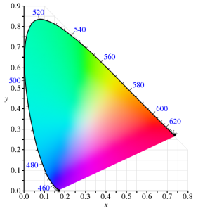
In 1931, the CIE helpfully built a model for quantitatively representing any color that humans are capable of perceiving. It used a model similar to our cones for transforming any visible color spectrum into a set of three values (XYZ). The model is defined so that Y is close to how we perceive luminance (brightness), and normalized to create x and y values that reflect the ratios of X, Y, and Z. and thus, the color of something independent of how bright it is. Roughly, this is the CIE 1931 color space (from Wikipedia):

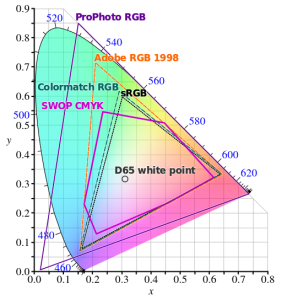
Since the very first color TVs, our technology has taken advantage of metamerism to use just three colors – typically red, green, and blue – to reproduce a much wider range of perceived colors. Good thing we don’t have 16 cones like the mantis shrimp, or a mix of red and green would seem nothing at all like yellow – forcing us to build many more primary colors into a display. Despite this, reproducing color accurately is still hard. First, there’s the shape above, which I heard cleverly referred to as “that darned curve that every engineer wishes was a triangle”; it reflects the nature of the cones in our eye, which make it impossible to reproduce some colors (e.g. pure 520nm light) with any combination of other colors. Second, while very pure color sources in our displays allow us to cover more of the visible range, current technology can’t easily produce pure colors. So to make our lives easier, we define color spaces that cover a subset of human vision, and are defined by three color primaries that we can produce (image from Wikipedia):

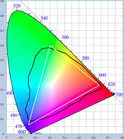
That small triangle in the middle that covers roughly 36% of what we can see? That’s the sRGB color space, and it is the dominant color space in almost all displays, digital photos, and digital video you’ll find today. Video standards like Rec.709 use the same color primaries; as far as I know, references to “NTSC” refer to Rec.709 and thus to the same colors. At first glance, sRGB seems depressingly small relative to our vision, to the point you’d expect displays to look terrible. Fortunately, much of what we can technically perceive doesn’t occur in our natural world. The color of almost all physical objects are based on what wavelengths of light they absorb, and no earthly substance can absorb all but a single narrow wavelength. The result is Pointer’s Gamut, which the linked article describes; it’s only modestly bigger than sRGB, and is shown via the black line below:
So when you look at a vivid alien world in Avatar and it seems like nothing you’ve seen on earth, it probably wouldn’t really look like that if it was real either :).
TVs, Displays, and Calibration
Limited though sRGB seems, most displays today are even more limited. When LCDs began to dominate over CRTs, they were only capable of covering roughly 70% of the sRGB color space – 25% of what you can theoretically perceive. The Dell WFP3007 I used until recently only had 72% sRGB coverage. Most budget monitors are also still at this coverage level – such as the HP 22cwa (the #1 monitor on Amazon), and essentially everything else in the sub-$300 category.
However, the last few years have seen much of the $500+ segment move to providing 100% sRGB coverage, and while still not that common, there are an increasing number of non-exorbitant “wide gamut” options that go beyond sRGB – covering some or all of larger color spaces such as AdobeRGB or DCI-P3 (which are almost 50% larger than sRGB). The new UHD Premium specification for TVs requires at least 90% coverage of DCI-P3, meaning we’ll see more and more displays with wide gamut support.
If you’re looking for a display or TV, should you always get as wide gamut a display as you can? Unfortunately, it depends. It definitely makes sense to ensure that you’ve at least got 100% sRGB coverage – this will do a good job rendering all content that’s out there, and most disc players, cable/satellite boxes, game consoles, PCs will simply assume that your display reproduces sRGB. But when you go beyond 100% sRGB – perhaps to a display that can show the full AdobeRGB or DCI-P3 color spaces – most content will appear over-saturated by default. Sure, you can turn down saturation or use “sRGB mode” if the display offers this, but in that case why get a wide gamut display at all?
For computer displays, accurate yet wide color requires two things: installing or creating an appropriate color profile for your display, and use of color managed applications. On Windows, it is up to you to manually install a color profile for your display. On Windows 10, Display Settings > Advanced Display Settings > Display Adapter Properties > Color Management… (in the Color Management tab) will open the Color Management tool that allows you to add, remove, and choose the default color profile:

Of course, this assumes your display manufacturer provides an color profile (normally a “.icc” file) for your display. If it doesn’t, you can pick the closest standard color space. However, the better option if you really want the most accurate color is to build a profile for your display. This beats a manufacturer-supplied one, as every display is different and changes over time. Plus, the process of building a profile can help you optimize your display settings. To do this, you’ll need a colorimeter and calibration software that works with it. I bought the X-Rite i1Display Pro, though the less expensive Colormunki Display is probably equivalent. These are USB peripherals that sit on top of your screen and tell your computer what color is actually being displayed (photo is X-Rite’s):

One word of advice: if you do go with X-Rite, don’t install their software. It’s truly terrible! In it’s default mode of operation, it didn’t help at all with adjusting settings on the display, created a ridiculous profile that attempted to do all white balance and output brightness adjustments on the computer by reducing the output levels of the RGB channels accordingly. This looked awful and created obvious clipping and banding in images. Worse, it somehow installed at the GPU level somehow, making it really unclear how to remove or reset this. Eventually, uninstalling their software, fiddling with some things, and rebooting got me back to the much better state in which I started. Fortunately, vastly better open source, DisplayCAL (and the underlying Argyll CMS software it uses) is available. It’s free, but it worked so well for me that I made a donation to contribute to its ongoing development.
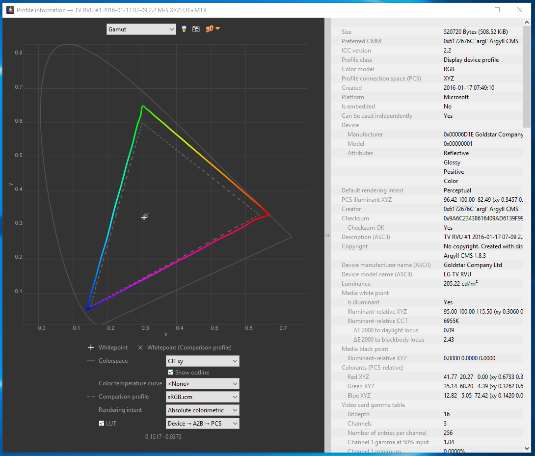
One of the goals of calibration is to achieve a particular white point. This is important for any photo editing, or else once you get things looking right on your screen, the white balance will look off everywhere else. Calibrating to a 6500K white point will usually make sense. The DisplayCAL software was particularly helpful for getting this close using controls on the actual display, so that the connection between your computer and display can still use the full available range. Otherwise, creating a profile is surprisingly automatic, and at the end of the day, I had an accurate (hopefully!) .icc profile for my LG EG9600, and a better understanding of it’s coverage relative to sRGB:

Cameras and File Formats
What’s next after calibrating a wide-gamut display? Do you need a wide gamut camera to go capture this wider range of colors that your monitor can now display? Fortunately, the answer is no – unless you want a camera that can capture infrared images! Cameras don’t have the tough task of creating light at specific wavelengths; they only need to filter light, and that’s a much easier task. Even the digital cameras of 10 years were capable of capturing color well beyond what current displays are capable of reproducing.
However, this isn’t necessarily the case with file formats that the camera stores. If you shoot JPEGs, then your camera has to convert the very wide range of color that its sensor is capable of to one of the narrower color spaces that is appropriate for a JPEG. The most common of these is – you guessed it! – sRGB. Any colors in the original image outside what sRGB can represent get mapped to the closest matching color (which may not really be very close at all). Most DSLRs offer the option of recording in a wider color space, like AdobeRGB, but this has many issues of its own, as laid out in this fstoppers article on AdobeRGB vs. sRGB. One issue it doesn’t mention is that trying to represent more colors when you’ve only got 8-bits per channel to do so makes AdobeRGB more likely to result in banding (e.g. in the gradient of a blue sky). The biggest headache, though, is that you’ll likely need to convert the image to sRGB anyways before publishing or sharing it.
And if you’re going to do that, you might as well use RAW for this purpose. I’ve always thought RAW was the right choice, especially for non-photographers who make mistakes that RAW can help recover from. For color, RAW is vastly superior; it captures everything the sensor is capable of detecting, and doesn’t throw information out to produce a JPEG in a narrower sRGB space. Even if you don’t use this now, in 5 or 10 years from now you may see colors you never knew were being captured all along. Today, you’ll still export from RAW into sRGB JPEGs, but if you keep the original RAW images around, then when a wider gamut standard like Rec.2020 finally becomes commonplace even for images, you’ll be one automated re-export away from benefiting.
Color Managed Applications (and Services)
Does everything suddenly get more accurate as soon as you install that shiny new .icc profile? Sadly, not. Only applications that are color-aware will even pay attention to the fact a profile is installed at all. The significant majority of applications ignore it, and continue to crank out sRGB images that will look oversaturated when displayed using the full gamut that a wide gamut display offers. Things are apparently much better on Mac in this regard, but on Windows, just three applications I use have any form of color management:
- Adobe Lightroom. Since this is where I do all my photo editing, it’s really the only application that matters to me. I really do rest easier knowing that I’m not spending hours and hours editing photos solely to make them look better on my monitor. I know given the current state of the world that almost any photo I share will be viewed on an uncalibrated monitor, but since many of the photos I take now are for looking back later, I’m optimistic that this will make a difference on the highly color accurate display technology of the future :).
- Adobe Photoshop. I don’t use this, but it is certainly color aware!
- Web Browsers (partially). Outside of photos and games, virtually 100% of my time is spent in the browser, so in a way this is the only application that matters. Today, Chrome color manages JPEG images that have a color profile attached (but doesn’t manage untagged images, which is most of them). We’re hard at work making this better, so I’m optimistic that soon everything will be accurate! Firefox similar has partial color management. Safari is fully color managed. Surprisingly, both IE and Edge seem to entire ignore output display profile!
A feature of Lightroom I’d never used before is soft-proofing; it’s a feature designed to let you preview what output will look like. When in soft proofing mode, you can specify a target color space, and enable an out-of-gamut warning; this will show any parts of the image with colors that can’t be accurately represented using bright red (or some other color of your choosing). For example, consider this simple shot of Teh O Limau Ais (iced lemon tea at a Malaysia food stall):
The image you’re seeing was already converted to sRGB, as nothing else really works today. But how much of this image was out of gamut? As it turns out, quite a lot:

So, why not exporting JPEGs in a wider color space that preserves captured color at least to the extent that I see it when processing photos on my display? For starters, an 8-bit JPEG is going to produce more banding when used with a wide color gamut; a 10-bit+ image format is really needed to make this practical. But even if that wasn’t an issue, essentially every service – including SmugMug, which I use for hosting photos you see here – converts anything you upload to sRGB. In part, this is because the vast majority of web users have displays that are sRGB at best, and more typically 72% of sRGB. It’s also because web browsers historically didn’t properly handle images in non-sRGB color spaces and would display them washed out. While that’s largely no longer true – Edge, Chrome, Firefox, and Safari all handled ICC-tagged JPEGs – people do sometimes stay on old browser versions for a while.
Summary
So that was long and complex, but I think I’d summarize as follows:
- If you don’t edit photos or do color work, when you’re getting your next monitor, get something that’s 100% sRGB (or use your monitor in sRGB mode), but not wider. Unless you like unrealistically saturated colors, which you may!
- If you edit photos or really want accurate colors, consider a wide gamut display. But be prepared to invest in calibration, figure out which of your apps are color aware, make sure you’re shooting RAW, and have patience until file formats and the web catch up with you. If you’re shooting memories for the long term, it will pay off at least a little!

